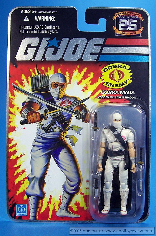
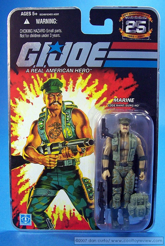
"Legal reasons" Hasbro couldn't use their own art? Come on now. You know that's bunk or we wouldn't have seen 25th anniversary cards like this:
As far as "logistical reasons," who cares? That's no excuse to release bad art. If they don't have a good copy of the art from a number of figures (like Beach Head, Snow Job, etc.) then for crying out loud at least hire some hack who doesn't have the inking skills of a two year old. Flash is a perfect example of "tweaked" art done right. It was obviously redone but with enough skill to still look presentable.
I really don't understand your undying hatred for the tweaked 25th Anniversary art. It's by far the best we've had (or will have) since '82 - '85. Seriously, what is "crap" about that 2nd Beachhead card art, other than it has been tweaked to look more like the new figure? From a design standpoint, they're almost exactly the same.
It was just badly drawn and that's all there is to it. Rob Liefeld's Captain America was almost exactly the same as Jack Kirby's from a design stanpoint, its just that the Liefeld rendition sucked.
And even if they COULD have made the cards completely identical, you know the collectors of the original carded figures would have a ^^^^ fit.
Show me one post on any forum from any site of someone who complained about Hasbro using the original card art for Storm Shadow or Gung Ho for the 25th line.
Your last PM to me definitely proves that you're "the man" duff) but you're off base here. If I'm too anal about those cards then why don't you use your rewards points to pick up the SSC 1/6 scale Ark of the Covenant. I'm sure there were logistical reasons why is wasn't as screen accurate as Hasbro's version.
CNN did a small write up on the movie today and pretty much said it was non stop action and entertaining. I think we may have been wrong on this one. I may go see it now. It is getting better reviews than transformers or Salvation.
Honestly I understand were both "parties" are coming from...
I enjoyed the AVP movies as I didn't have high expectations for them...
and after all, they will hopefully lead to good things like "Predators" and the "Alien" prequel...
I do think that crappy movies will be here forever... but Hollywood needs to realize that they can make GOOD movies regardless of the theme...
not over the top crap like Transformers 2...
I do think that G.I. Joe would be better than Transbloopers 2...
I know, I know... it's not that hard...
This year, except for Watchmen, has been very disappointing blockbuster-wise...
CNN did a small write up on the movie today and pretty much said it was non stop action and entertaining. I think we may have been wrong on this one. I may go see it now.


 You are WAY too anal about that. There are logistical and legal reasons why the same exact art was not used on all of the new packaging.
 From a design standpoint, they're almost exactly the same.