Hot Toys 1/6 Black Panther Erik Killmonger

Collector Freaks Forum

Help Support Collector Freaks Forum:

This site may earn a commission from merchant affiliate links, including eBay, Amazon, and others.
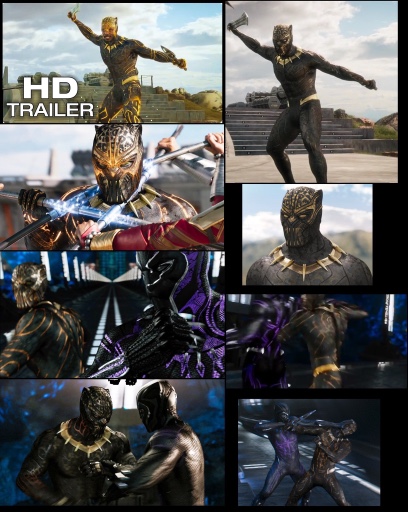
Thanks! Looks good. I saw a tiny pic (with poor resolution) that made it seem like the lines on the mask may have been flipped to gold. I'm glad that's not the case. That said, is it weird that HT chose to display the lines & letters on his suit as "glowing" from absorbed energy but not the lines on his mask? Does anyone recall if they glowed in the movie?

They only glowed when the suit was taking damage like T?challas. Wonder if they went this route to give the same effect since they couldn?t get the UV feature like Black Panther to look good on this.
 
They only glowed when the suit was taking damage like T?challas. Wonder if they went this route to give the same effect since they couldn?t get the UV feature like Black Panther to look good on this.

Understood regarding when the suit glowed - I was asking specifically about the mask (i.e., did it glow too?).
 
77089e9221738916e26b4c0c674c61c6.jpg


This collage shows the mask glowing for reference


Sent from my iPhone using Tapatalk
 
I think he looks pretty awesome but there are other figures I would rather have. If i saw this at a 25% discount I would probably get it though I doubt that will happen. It looks 10x better than v2 black panther.
 
It definitely looks pleasing to me, looking good. Can't wait to get this villain, as HT villains are few and far between.
 
I think the sculpt turned out really well, wish they would have just picked a look on the suit and been consistent with it though. Paint the gold lines for the powered up look sure, but the helmet needs more gold too in that case. Or don't, have both "unpowered". Now there's a combo that doesn't make sense. Not on my list but if I had one I'd go with the headsculpt look just to avoid the mismatch.
 
Starting to like it the more I see. Probably one of the more giraffe necks I?ve seen tho when using the regular headsculpt
 
I think the sculpt turned out really well, wish they would have just picked a look on the suit and been consistent with it though. Paint the gold lines for the powered up look sure, but the helmet needs more gold too in that case. Or don't, have both "unpowered". Now there's a combo that doesn't make sense. Not on my list but if I had one I'd go with the headsculpt look just to avoid the mismatch.

I think I've gotten use to those gold lines...I absolutely hated it when I first saw it cause it looked really cheap (maybe it was a bad photo?) but yeah I tend to agree with you, HT should have settled on either doing the basic or powered up look and not a mix of both. I watched Killmonger's fight scene again and he was only charged up for a brief second when him and BP battle in the underground rails, cause otherwise he was not charged for the majority of the time he wore the Golden Jaguar suit.

Either way, I'll need to see some review videos before I pull the trigger, but as of right now, based on the photos I've seen, I'm leaning towards going for it.
 
Agree with you guys, the more I see the lines, the more I like it.
Yes it's not screen accurate but it make the suit pops up. It's just that in some photos the lines are too yellow it makes the suit look cheap. But have a feeling it's not that yellow in person.

Sent from my SM-G950F using Tapatalk
 
I think I've gotten use to those gold lines...I absolutely hated it when I first saw it cause it looked really cheap (maybe it was a bad photo?) but yeah I tend to agree with you, HT should have settled on either doing the basic or powered up look and not a mix of both. I watched Killmonger's fight scene again and he was only charged up for a brief second when him and BP battle in the underground rails, cause otherwise he was not charged for the majority of the time he wore the Golden Jaguar suit.

Either way, I'll need to see some review videos before I pull the trigger, but as of right now, based on the photos I've seen, I'm leaning towards going for it.

Agree with you guys, the more I see the lines, the more I like it.
Yes it's not screen accurate but it make the suit pops up. It's just that in some photos the lines are too yellow it makes the suit look cheap. But have a feeling it's not that yellow in person.

Sent from my SM-G950F using Tapatalk

Yes, I'm warming to the gold lines. IMO there are two factors influencing this:

1. The lines actually look more gold now, whereas on the convention figure they appeared yellow. Regardless of whether that was due to poor photography/lighting or if HT went back and fixed them, they're less distracting & more pleasing to the eye now;

2. There's enough gold on the mask to effectively offset the "mismatch" with the black lines on it vs. the gold lines on the suit.

What I'm most pleased by is that the jaguar pattern on the suit is more prominent than on the convention figure. It's quite possible that the harsh lighting at those shows simply washed it out, but nonetheless it's good to see.
 
I also noticed they painted the fangs around the necklace to be more screen accurate which is nice. On the proto they were all white, now they have some yellowing at the base of the fangs. Nice touch. I bet the gold looks good in person, not yellow, it?ll match the gold on the necklace & belt area.
 
Going to keep a very close eye on this one, it's not one I have to have ASAP, but I also don't want to miss him like I did with Hela. Could very easily see him skyrocketing once sideshow stops selling him.
 
Going to keep a very close eye on this one, it's not one I have to have ASAP, but I also don't want to miss him like I did with Hela. Could very easily see him skyrocketing once sideshow stops selling him.

Agreed. I don?t imagine they made as many as Black Panther. Shuri didn?t seem to have a huge run so I imagine this being a villain even less produced.
 
Yes, I'm warming to the gold lines. IMO there are two factors influencing this:

1. The lines actually look more gold now, whereas on the convention figure they appeared yellow. Regardless of whether that was due to poor photography/lighting or if HT went back and fixed them, they're less distracting & more pleasing to the eye now;

2. There's enough gold on the mask to effectively offset the "mismatch" with the black lines on it vs. the gold lines on the suit.

What I'm most pleased by is that the jaguar pattern on the suit is more prominent than on the convention figure. It's quite possible that the harsh lighting at those shows simply washed it out, but nonetheless it's good to see.

Yeah, I'm with you on that. What I feel made the gold lines look bad in that particular photo (the one where everyone criticized it for looking cheap a month ago) was that the jaguar pattern was very muted and washed out to the point that it was non-existent, which could have been due to poor lighting, but now that the jaguar pattern is more blatant it def looks nicer and more premium.

I'm def leaning towards getting this since the head sculpt turned out quite well. I'm fairly certain the impending video reviews will be quite positive, so it would really need to take some unforeseen awful factors to make me not want this at this point.
 
Back
Top