G.I. Joe: Classified 6" figures

Collector Freaks Forum

Help Support Collector Freaks Forum:

This site may earn a commission from merchant affiliate links, including eBay, Amazon, and others.
I’m glad I don’t hate Destro. He’s what I call a line killer if they don’t get him right. *cough*sideshow*cough*

I got into Sideshow's 1/6 line of GIJOE way late and only managed to pick up Zartan and Destro. I guess I might be in the minority but I absolutely love Destro.
It's not spot on with ARAH but I was really pleased with the product, especially his wide array of weapons and accessories.
 
I liked him well enough but it was very clear he killed that line. Destro more than almost any other character gets redesigned over and over again. Most are Ok and some are horrible. I felt SIDESHOW’s was ok. I knew he was never going to be classic ARAH like some many wanted him to be. He just didn’t fit into the more realistic Looks sideshow was going for.
 
I liked him well enough but it was very clear he killed that line. Destro more than almost any other character gets redesigned over and over again. Most are Ok and some are horrible. I felt SIDESHOW’s was ok. I knew he was never going to be classic ARAH like some many wanted him to be. He just didn’t fit into the more realistic Looks sideshow was going for.

Right on. I missed all of the pre-production drama and speculation.

I really hope the Joe line makes its way back to the 1/6 arena, whether it's Sideshow or Hot Toys. Maybe the new Snake Eyes movie later this year will get it started again.
 
The guy who did the Valaverse Kickstarter did a Youtube review of the Snake Eyes ex. figure, and he had a lot of interesting things to say. The video he did was about an hour long, so if you don't have the time/patience to watch it, here's a basic write up of what all he had to say =)

I moved a couple of his comments around just so they could be categorized and read a bit easier. So this isn't a linear dictation =) And I bolded (what I thought) was the most interesting criticism he had (at the bottom in the 'Overall' section). His review ends at the 47 minute mark, and then he goes more into his Action Force line and what all he's doing with them in comparison to what this Snake Eyes has. And I pretty much caught all of his thoughts down here, so hopefully people will have an easier time reading this than trying to watch an hour long video =)


https://www.youtube.com/watch?v=DKGxINsHCrE&t=3s


He starts with the exclusive packaging -

He has a love/hate relationship with packaging. He appreciates it, but at the same time as a product designer he wants more resources put into the product/figure. With an overly expensive packaging, it takes away from the toy itself.

He feels the consumer isn't buying the product for the packaging. For Comic Con items, you certainly want flashy packaging, but a lot of times it can be overdone.

If you have a package that doesn't really incorporate things, like a file card, it's a bit of a waste.

This Snake Eyes exclusive packaging is very well done. It's nice chipboard material (like a board game box), it's heavy, and has nice embossing. But he still feels it's overdone because he would have wanted more to be invested into the product itself. He understands that it was done for CC, though.

It's a nice image on the outer box that's also printed on an insert of parchment paper. It's a nice touch, but it's an extra bit that doesn't add much to the value of the item. You could frame it and hang it on your wall, maybe...


Interior of the exclusive packaging -

He thinks it might be overdone with the foam packaging. He thinks it's very well done, but again it doesn't add to the value of the overall package. There's a lot of empty space.


The figure packaging -

The figure package is executed very nice. The artwork that's been released with all the figures is on the back, and he's not a fan of all the designs of said figures. He says it's nice, but unneeded.

He says Hasbro hides a lot of dead space in their product. Large images on the front will hide dead space, which is a waste of resources into making a box look bigger even though nothing's filling it.

Every iteration of GI Joe came with file cards, and he's baffled how this line doesn't. You could have put the rear artwork of the interior figure on the back of the large outer box and put a file card on the interior one. There are so few throwbacks to the roots of GI Joe here, and at some point Hasbro needs to pander to the older fans who can afford these high prices to begin with.


The figure -

Nice design. Interesting take on the costume. Hasbro went with the second Snake Eyes design instead of the first, and he feels the first commando SE should have been released first, but the second "visor" version isn't bad at all.

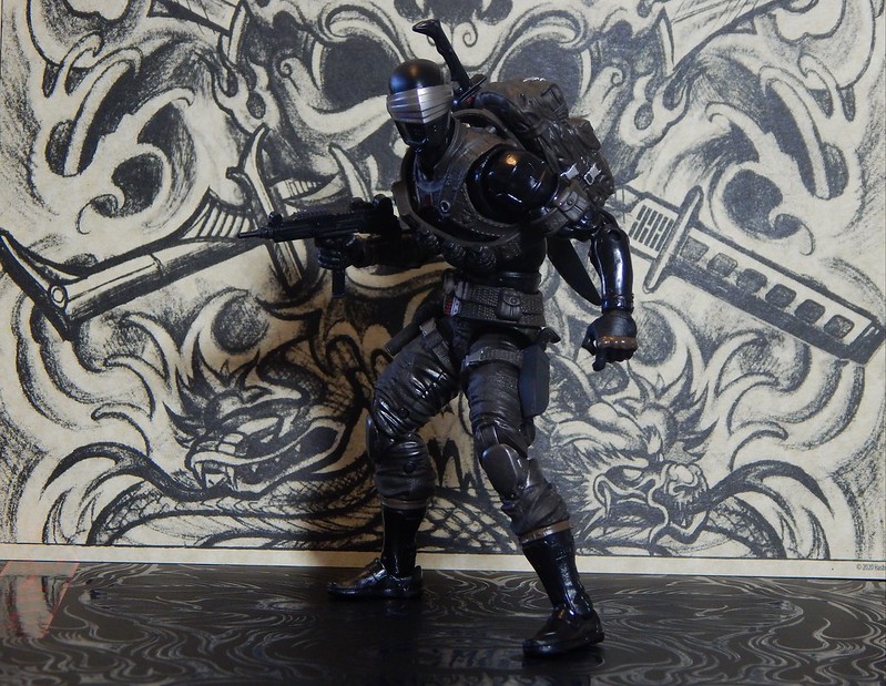
He thinks the Hasbro designers took a lot of cues from the Retaliation costume, which was nice with a good balance of textures.

He's not crazy about the head sculpt. Feels the mouth vents and chin strap piece are distracting, and that Hasbro should have done one or the other and not both. But that's okay.

He has issues with the deco of the figure. The Retaliation design had some brown in it, but he feels it's a bit boring. He didn't want just a straight black figure for this 6" figure, but breaking up the deco on this figure with the brown, grey, and metallic colors was overdone.

They brought in too much grey into the arms and legs, and the brown looks ugly. The browns on SE's straps and arm guards are different browns, and that makes no sense. It's a big miss being on the figure overall all, and he would have gone with grey/dark grey instead.

Brown gives the feeling of leather, and having that color on the knuckles makes no sense. It should have been a metallic or flat dark grey, which would have made them pop more.

He does not like the pants being the color it is. It should have been black to pay homage to the original figure as the grey dominates the figure too much from top to bottom.

The Arashikage emblem is fine, but it's in too many places. The symbol on his chest is already showing signs of wear and is rubbing off.

The belt design makes no sense. It's one grey colored piece that looks like two belts that kinda looks like "a Liefeld (design)" that's there for no reason. It doesn't hold anything (weapons - molded or not) and with so much grey in the figure already, it kind of gets lost.

The knee pads are lazy. The front metallic is nice, but making the wrap around to the back of the knee metallic as well makes no sense. Why would the cloth part be the same color as the metal knee part?

The pins in the figure (for articulation) is lazy. They're all black instead of being the same color as the part of the figure they're holding together. Grey pants with black pins is a miss because it's an easy fix that he had done many times while he was working in Hasbro (most notably on the Marvel Legends line). He feels that when you're paying $50 for a figure, you wanna make sure it's worth the cash you're paying, and little misses like that tend to take away from the idea of it being a premium item.

The boots have more brown color, again, and Hasbro was very inconsistent with their paint finishes. Hasbro has a large book of paint chips with various finishes, and painting any piece in any type of finish is free - it's not an extra cost. Using gloss finishes and matte finishes should have been more closely payed attention to. The boots have too much gloss.

The (personal) glaring design problem he has are the design of the grenades. They're WW2-Vietnam pineapple grenades that don't exist in today's military. The design is a miss to him as he would have tons of reference folders to make sure things look correct and accurate. And since this figure line is being designed to look more modern day/post-2000 military, it bothers him a lot.

The shoulder/torso harnesses is nice and interesting, but it's a separate piece that keys into the torso. If you take it off, there's a weird area underneath that has no sculpt to it. Hasbro isn't giving the fans a chance to take it off (if they want to) because it leaves a blank space on his chest.

He loves the detail on the pants, with a nice texture of canvass to it. The detailing is great.


The Accessories -

The backpack is sculpted very well and with great detail. The Arashikage logo on the sword sheath is so small and unneeded, especially when it's plugged in sideways to the backpack.

He was never a fan of the sword design, even on the original figure, but it's fine for what it is.

Overall, he's not a fan of the weapon accessories because Hasbro has a knack for doing accessories in pvc that tends to bend/warp over time, look glossy, and look cheap. Giving some kind of matte finish to the sword would have made it nice
There's lots of throwback weapon designs that look like older real world stuff (larger silencer, older uzi design, older pistol) that doesn't look modern.

You can't defend the weapons being a basic black by being a throwback to the old SE because this new one now has brown pants (note - he said grey at first, but now brown. I'm not sure what color they are).

The hands are ugly. The hinged fingers for the guns are wasted on the swords and blades because they'll just stick out. Hasbro should have included swappable hands - c-grips, fists, and something else (I couldn't hear what he said), so everything could look nice no matter what you posed him with.

He thinks the ninja star hand is a waste. SE holds a ninja star versus Marvel Legends figures who have attachable action effects to their hand pieces of them throwing out stuff (ninja stars, powers, etc).

The other hand makes no sense. It's a karate chop hand with a climbing spike. It looks unfinished because the unpainted band of the climbing spike wraps around the knuckles and hides the detail there.

There are no stands with this GI Joe line, and he remembers with Retaliation that when it/they didn't come with stands that collectors lost their minds and complained.


The Weapons Rack -

Is very nice. Very well done, but the deco of the weapons is bad. You spend $50 on a figure, and none of the weapons have any deco on them. Everything is glossy black and cheap. When you see them on the rack, it's black on black with only the tan background of the rack. The (investment of) money is there, and Hasbro could/should have taken some investment out of the packaging and put it into the product. Make the toy feel more premium. At the end of the day, he has a big heavy box, but unpainted weapons. He could be wrong, but he doesn't think he's wrong.


Articulation -

Very well done, and they're the high points of the figure. It's doing things that other Hasbro 6" figures aren't doing across the board.

The neck is a ball with a ball on it, and moves very nice. He doesn't like the butterfly shoulder joints. They move back, but not forward. He doesn't like the ab-crunch, and is an ab-rocker fan. The waist swivel is nice, and the hip joints are the best feature of the figure. It's more simple than an import figure, and he hopes it will be imported to other Hasbro figures.


Overall -

He grades the figure a B+, but because of the missed things that were easily fixable that shouldn't have been missed, it makes his grade more of a B-/C+. The little nitpicks he had would have made the figure an A+ if they would have been done.
This figure being $50 is a problem. The figure itself is $20, so where's the other $30 extra investment going to? The weapons rack and the box are there. The weapons rack, with no deco, parts but no deco, with the mostly empty large box does not equal $30 of value.

GI Joe has no royalty, yet they're lacking a lot of accessories that they should have. You would think there would be more money invested into them since Hasbro doesn't need to pay any license fees for their own IP. But the problem is Marvel and Star Wars. You can't have a $20 figure packed full of stuff next to a Marvel figure with barely any accessories and a Star Wars figure which might have none. You can't have three similarly themed products next to each other in a store that has one line overloaded while another is empty. It's not fair to the consumer because this is a marketing decision by Hasbro and not a decision based on lack of resources.

His biggest problem with this figure is the price value. There's not enough here to justify the high price.

Hasbro only has one chance to get this line right, with the bad older movies and the upcoming SE movie, and it bothers him that this figure is only so good. If fans of GI Joe don't mind, then that's okay with him.

If the figure was $40, it would have been better. But $50, not including shipping and taxes, bothers him.
 
Very nice review! Basically hit on everything that I had issues with but the figure is still very nice. The multiple color palettes and the location of some of the colors does bother me, it just doesn't work for Snake-Eyes. Stick to blacks and grays and maybe an occasional silver...but the brown? Ugh. Also, the "visor" v2 Snake-Eyes has become the definitive look for the character, so Hasbro is always going to capitalize on that look FIRST before going back and doing his google'd "Commando" v1 release.

If they re-paint this figure but tone down the diverse colors and keep it simple, I might pick it up. I'm also a fan of the crazy 90's colors Joes they released as well, but you know what they were going with back then and most of the figures followed that motiff. Snake-Eyes v4 (1990/91) holds a special place in my heart as I had that figure for years.
 
No offense to the guy, but I looked up his Action Force line he was gloating about and I wasn’t that impressed . Maybe I have to see the finished product but there seems to be a lot of articulation limitation in his figures . In other words having this Snake in hand, I think it has better articulation than his project

We’ll see :lecture
 
To be fair to the Action Force line, it is a kickstarter funded release of figures that's being compared to a giant manufacturer like Hasbro (who already has a history of trial and error with other 6" figures for years now). I just like the guys critique of Snake Eyes on its own, as he's on point with how I feel about the other Joe figures so far (the odd colors, the odd designs, the lack of accessories, etc). And I really like his point about the waste of resources being put into the packaging that could/should have been invested into the figure instead. Plus, the eye opener about Hasbro self imposing a lack of accessories just so Marvel and Star Wars doesn't look trashy with their own releases is really mind breaking to me. I never considered that one franchise has to suffer because another one would look cheap on the toy shelves sitting next to it =/

It's why I didn't pre-order these figs online. I'm just not happy enough with how they look, and I'm going to try and let new toy/shelf-hype make me buy them if/when I see them in stores for the first time, lol
 
I agree with almost everything the Valaverse guy had to say about Hasbro's Snake Eyes, just that I like the brown colored pants. I'm sure we'll have a all black Snake Eyes on the next non-movie version (you just know Hollywood will screw the SE movie design up, they're compelled to reinvent the wheel because they think they know better).
The Valaverse guy used to work for both Hasbro & Jazzwares and gave kudos to Hasbro's SE on things like the neck & hip articulation so he comes across as honest. His figures should also have better gun holding articulation which is far more important on non-ninja characters like the majority of Joe & Cobra characters, so he has one up on them in that regard.
I have three Action Force figures on order with three accessory sets on pre-order with BBTS so I'll get to judge the figures in person. I also have to mention that his Action Force guns and pouches/packs are based on real guns & equipment, so you should probably look into getting those to replace Hasbro's anti-gun, laser blaster crap Joe weapons. I'm still puzzled why Hasbro didn't include the old fashion XMLR-3A Laser blaster with their new line, maybe it looks too realistic so they said no.
 
I really like this Snake-Eyes figure but I will agree with him about the packaging and extra weapons. The art on the outer package is nice but not needed. They really should have file cards and one artist creating the art for the illustrations. The extra accessories should have more detail too. Just plain black doesn't cut it. I could do without the jaw piece on his mask but it is not a big deal. The other colors don't bug me in all the pics though but that could change in person.
 
From Toy News International: https://toynewsi.com/9-36070

Official Wave 1: We all kinda thought and hoped Snakes would be the final figure.

Thoughts on Wave 2? Gung-Ho? Cobra Commander? Baroness? Troop builder?
 

Attachments

  • gijoe classified 1.jpg
    gijoe classified 1.jpg
    102 KB · Views: 144
I wish they would make a Storm Shadow in the next wave to go with Snake-Eyes. Baroness, CC and Gung-Ho are all welcome though. I can't wait to see how they update Spirit Iron Knife, Stalker, Snow Job, Serpentor with his chariot, Quinn, Road Block ver.1, Zartan and his swamp bike, Major Bludd, Flint, Lady Jaye, Torpedo, Airborne, Storm Shadow ver.2, Snake Eyes ver.1, Snake Eyes ver.3, Soft Master and Bazooka. I'm hoping they get as deep as Cobra La and the October Guard.
 
What figure is that cartoon rifle from?

Believe it or not it was from a snake eyes custom I got a long time ago , it didn’t look good with the actual custom and I forgot I stored it .

When I took it out , I realized it was the right size and reminiscent to the cartoon :yess:

I’m thinking of painting it to match the cartoon more :wink1:
 
Back
Top