I've never been a fan of NECA packaging, it tends to look very unprofessional and more like a second stage mocks than final retail packaging.
Where to even start...
1. There should be a red line. However the red line is not part of the artwork, but the die/trim line where the board is to be cut. If it's not the trim line, then the J notch at the top will get destroyed on the shelves. Therefore this is not indicative of the retail art.
2. The front predator illustration is flat, lifeless and amateurish. Why is the (wrong) netting all floating 1/8 off his skin? Why are there hard leaf shadows on the helmet if it is night? Predator needs a lot of tweaks to make it look decent.
3. On the back of the packaging "Also available" should instead be "Series 1". They are showing all of the series including the figure being sold, in this case Jungle Dutch. If they want to say "Also available" then they should have removed Jungle Dutch.
4. List the names of the other figures!
5. The Jungle Predator on the back is an old photo and does not have the new ball joint hips.
Hey guys I'm a collector of 1/6 HT Preds, but I took the plunge today and ordered a 1/4 scale NECA Warrior Pred! Amazon $86.00 shipped Also Merry Christmas!
My wife just came home from ToysRus with the jungle hunter/city hunter 2 pack. Sweet
I dig 'em but was wondering, have they made a jungle hunter with the updated hip joints yet?
My wife just came home from ToysRus with the jungle hunter/city hunter 2 pack. Sweet
I dig 'em but was wondering, have they made a jungle hunter with the updated hip joints yet?
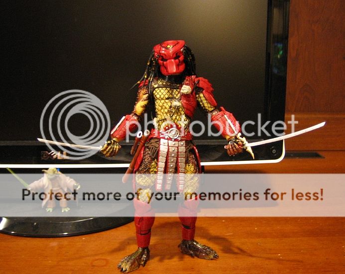
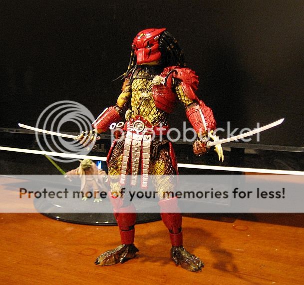
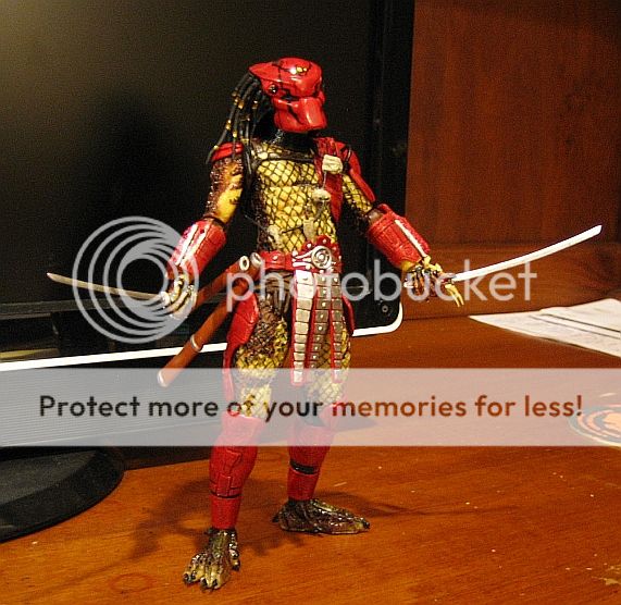
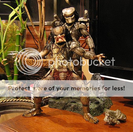
Finally got Big Red today! I think he is my new favorite NECA Pred. Just a gorgeous figure...I can't stop looking at him lol. The colors contrast so well with each other and his overall samurai look is so cool. You can get some really sick new poses with the new updated articulation too
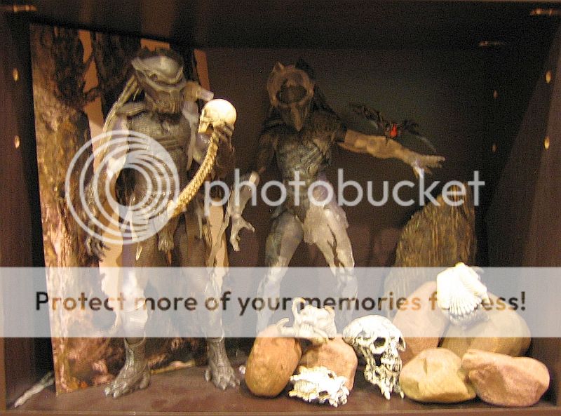
Here's some pics of him along with some of my other recent NECA pickups.
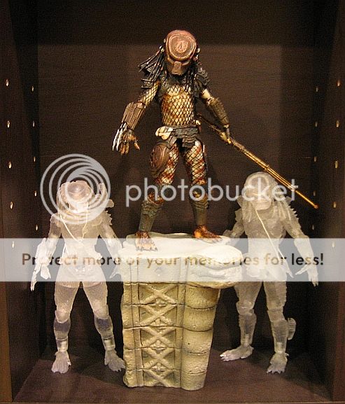
(I didn't care too much for these guys at first but displaying them together actually make them look pretty sweet too!)
(Jungle Hunter from 2 pack. We can finally get the classic pose done right now. This guy is also one of my favorites due to improved paint and articulation).


")