I appreciate the understanding and I assure you all, if you could see the heads in person and hear how the paint actually cracks when pressing your thumb on it, I'm not just being some super picky baby. It looks muddy at a distance and up close you can see it's an absolute mess. Like the decal was applied partially dry already so some of it is onto of grooves, rolled up, looks melted (they likely run them through heaters. I worked in a production factory and we put parts through an heat room to "dry/cured" the paint within a min etc instead of air drying) but best believe I am I taking pics and vids and contacting asap. I don't even care bout the masked head either just want the two most important ones replaced.That's absolutely unacceptable, clearly a manufacturering defect during production. It should never ever have been sent out. Don't wait, shoot them pics, videos and an email asap, I'd be so livid if I received a piece in that condition. Would ask for a refund in shipping and for the parts to be shipped express at no additional charge. This is almost a 2k statue and your first Prime 1 piece, you only experience the initial butterflies and excitement once (not the same the second time around). Just not on, poor form by Prime 1. I'd also ask them to take videos and photos of it before shipping (I did this before with one of mine and they agreed) to ensure no corners are cut and you receive the best pred heads possible.
You are using an out of date browser. It may not display this or other websites correctly.
You should upgrade or use an alternative browser.
You should upgrade or use an alternative browser.
Prime 1 Big Game Jungle Hunter Predator 1/4
- Thread starter Unknown Hero
- Start date


Help Support Collector Freaks Forum:
This site may earn a commission from merchant affiliate
links, including eBay, Amazon, and others.
Not the final display area, but I do wanna add some positives. His pose is incredible at so many angles, the bio mask looks odd like stone in pics but in person it so much better, the prototype mask that I wanted the least impressed me the most. It is just memorizing to look at!
Attachments

BOTH unmasked heads, the entire paint job. And the removable mask but that gets covered up so I'm not even worried bout thatIs it on all of them or just saw me head?
They should just send out a replacement head then... That really sucks.. Sorry.BOTH unmasked heads, the entire paint job. And the removable mask but that gets covered up so I'm not even worried bout that
- Joined
- Oct 28, 2014
- Messages
- 1,346
- Reaction score
- 69
Omg I get it now, WTF no way dude. What the hell happened. Some how they let that slip in unacceptable. Contact them asap.Can't post long videos. Tomorrow I'll do an unlisted one for you'se.
- Joined
- May 2, 2017
- Messages
- 2,117
- Reaction score
- 349
I'm so sorry man! That's a bummer. Keep us posted please.
He's lucky he filmed an unboxing tbh. God knows if Prime 1 would've tried to blame him
They used decals on the whole head... and the spot patterns are still jagged and splotchy as if poorly hand-painted?
That settles it, then. They deliberately made this one look like cr-- er, like the comics in order to justify the 1/3 announcement. It's really not hard when designing a decal to adjust the spots so they'll look cleaner. The fact that they left weird overlaps and sharp points suggests they worked fast and chose not to fine-tune.
I suppose we should count ourselves lucky the overall piece is still decent, even nice by some standards, but P1's attitude remains disappointing.
- Joined
- Oct 28, 2014
- Messages
- 1,346
- Reaction score
- 69
To most they love it. I love mine. I wouldn't have kept it if it wasn't a great statue. I don't keep crap!! Haven't heard complaints other than a few. But this was a very bad quality control from the start and should have never been sent out. Idk what yours looks like but I stopped looking at it as the jungle hunter from the movie. I look at it for what it is and for what it is, is a comic jungle hunter and I think a 9/10 due to flat paint. Which was fixable. But your entitled to what ever you think the statue deserves. I particularly love it, for what it is. But saying making it look like crappier like comics. That's what it was. Straight out of the comics. So, not sure what you expected. But the thing I hate is what they did to this poor guy's statue.They used decals on the whole head... and the spot patterns are still jagged and splotchy as if poorly hand-painted?
That settles it, then. They deliberately made this one look like cr-- er, like the comics in order to justify the 1/3 announcement. It's really not hard when designing a decal to adjust the spots so they'll look cleaner. The fact that they left weird overlaps and sharp points suggests they worked fast and chose not to fine-tune.
I suppose we should count ourselves lucky the overall piece is still decent, even nice by some standards, but P1's attitude remains disappointing.
I just feel bad for this guy. He deserved better. All I am saying P1 better give him those heads shipped and then keep those bad ones as well. Because that isn't cool. They need to fix it. But that was one statue. Unacceptable? absolutely! But prime one made a great statue. To each there own.
Last edited:
For the sake of argument (the expression, not actually trying to argue here  ), one thing that's been bugging me is this. Here's the Big Game cover on which this statue is based:
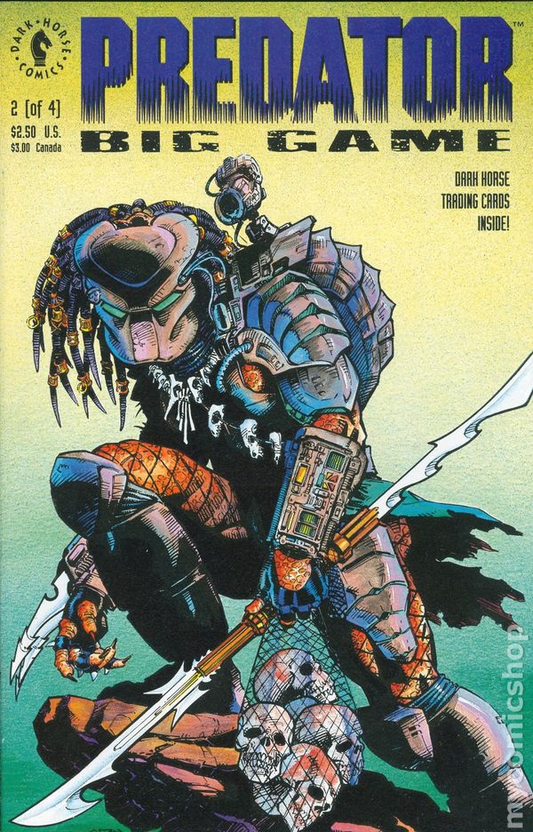
And here's one with a more modern coloring job, just to cover all the bases:
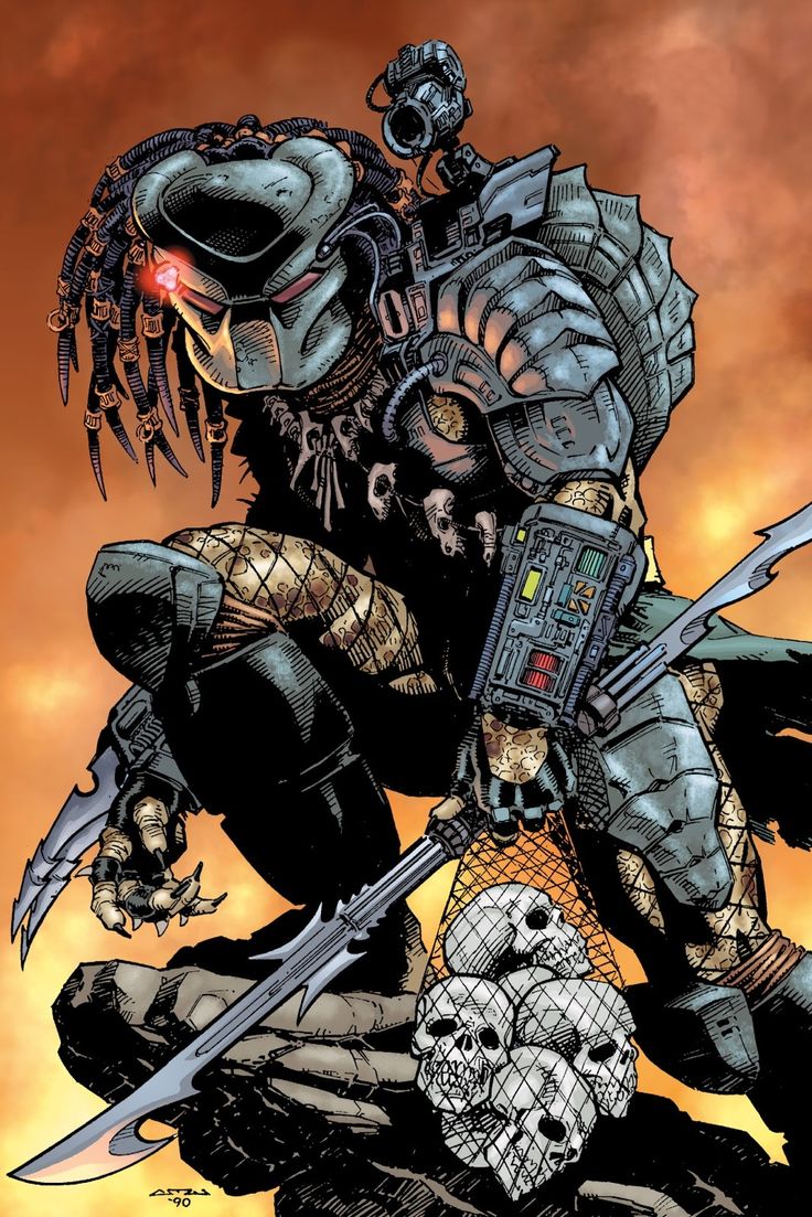
The Prime 1 statue doesn't really look like either of these. The skin pattern is completely different, the gauntlet lights are different, the netting is completely different (funnily enough, Prime 1's netting pattern is not only smaller than the film's, but the cover's too), and we never even see the unmasked head in these drawings.
Now, they obviously included the unmasked portraits and film accessories so this would work as a stand-in for the Jungle Hunter, but that brings me to my point: the comics argument doesn't hold water the way Prime 1 probably hoped it would. The prototype reads as a movie statue and the final product reads as a rushed movie statue. If they truly cared about recreating the cover art or making it "stylized", they would have matched the coloring and design more closely. But they didn't. It's just a label to hide behind and a poor one at that.
Heck, look at how the loin cloth billows in the wind on the cover. Look how it's tattered. This is an effect they've done on so many of their Batman statues and they easily could've done it here, but they opted to make it look like the film instead. They swung with the intention of getting a homerun, then backed off to third base and we're acting like they always planned on stopping there.
Objectively it's a nice piece and kills most of the competition out there, but at the same time, it's not what it was marketed to be -- by either film or comics standards. It's ok to enjoy it and still acknowledge that. Prime 1 doesn't need anyone making excuses for them.
), one thing that's been bugging me is this. Here's the Big Game cover on which this statue is based:
And here's one with a more modern coloring job, just to cover all the bases:
The Prime 1 statue doesn't really look like either of these. The skin pattern is completely different, the gauntlet lights are different, the netting is completely different (funnily enough, Prime 1's netting pattern is not only smaller than the film's, but the cover's too), and we never even see the unmasked head in these drawings.
Now, they obviously included the unmasked portraits and film accessories so this would work as a stand-in for the Jungle Hunter, but that brings me to my point: the comics argument doesn't hold water the way Prime 1 probably hoped it would. The prototype reads as a movie statue and the final product reads as a rushed movie statue. If they truly cared about recreating the cover art or making it "stylized", they would have matched the coloring and design more closely. But they didn't. It's just a label to hide behind and a poor one at that.
Heck, look at how the loin cloth billows in the wind on the cover. Look how it's tattered. This is an effect they've done on so many of their Batman statues and they easily could've done it here, but they opted to make it look like the film instead. They swung with the intention of getting a homerun, then backed off to third base and we're acting like they always planned on stopping there.
Objectively it's a nice piece and kills most of the competition out there, but at the same time, it's not what it was marketed to be -- by either film or comics standards. It's ok to enjoy it and still acknowledge that. Prime 1 doesn't need anyone making excuses for them.
Last edited:
xpl0sive
Super Freak
The decal itself is printed like that. Does not matter how you apply it, the spot pattern would still look incorrect as thats how it was printed.They used decals on the whole head... and the spot patterns are still jagged and splotchy as if poorly hand-painted?
That settles it, then. They deliberately made this one look like cr-- er, like the comics in order to justify the 1/3 announcement. It's really not hard when designing a decal to adjust the spots so they'll look cleaner. The fact that they left weird overlaps and sharp points suggests they worked fast and chose not to fine-tune.
I suppose we should count ourselves lucky the overall piece is still decent, even nice by some standards, but P1's attitude remains disappointing.
This wasn't deliberate...not IMO. That doesn't make sense to me. Why would a company water down their own statue intentionally and make it look worse, just to make another look better? The 1:3 is awesome regardless, and people would still want it even if the 1:4 turned out perfect. Those who ordered the 1:3 wouldn't have changed their minds just because the 1:4 turned out like the proto.
To me this is just a factory stuff-up, like we have seen in the past. Was probably too expensive to go back and correct.
I remember when PCS Rambo 1:3 came out, his skin tone was noticeably darker compared to the original prototype, making him look Mexican. PCS later admitted that the factory stuffed up and that it was too late to change as they were already half way through production, and that they wouldn't use that factory anymore (as they also made another statue too dark).
End of the day, everyone knows that its the original Jungle Hunter from the movie, even if its not totally movie accurate. It's still the best representation of the character thus far IMO. It's just that the factory stuffed up with the final production, but lucky for Prime 1 it still looks good for the most part.
That's what I'm saying. If you have a dot pattern on Illustrator and it looks jagged and overlapped, wouldn't your boss tell you to fix the overlaps? We're talking mere minutes of work here, yet it was pushed forward as it was. It's too close to the film to be called stylized, so either they couldn't produce a clean decal (unlikely) or they chose to go ahead with the first pass because time was short and/or this wasn't the big kahuna anymore.The decal itself is printed like that. Does not matter how you apply it, the spot pattern would still look incorrect as thats how it was printed.
Whether it was a factory error, a calculated oversight, or some combination of the two, we shouldn't cover that up by calling it stylized. An art student who submits a stick figure to a life drawing class and says it's just their style gets laughed out of the room.
Just to be clear, it's the narrative around the statue that irks me more than the statue itself here. We're lucky the final product turned out well enough to satisfy most of its owners despite this. But this -- justifying declines in quality as intentional -- is not a precedent we should be setting. Not at the $1500 mark.
Last edited:
Yeah it does annoy me that people make excuses for it. Don't know why people wouldn't want the prototype we saw over what we got. Even if you love the 1/4, there is no way in hell you can tell me with a straight face that you'd rather it in its current state over the perfect prototype
I think we can praise the 80% of the statue that was done right. While also pointing out the, not just bad but deceptive. Sorry but this paint is a bait and switch. I bet they hired ppl to lay on water slide decals that don't even know anything about painting. Just some random factory workers. Sure a painter did the fading with a air brush, but what they showed us, very what we got, is two totally differnt things (when it comes to the skin work)
Attachments


xpl0sive
Super Freak
Agree. Unsure what happened in production, but it definitely wasn't intentional lol. I don't agree that it was changed to represent the comic because as you pointed out, it looks different from that too, including the dreads, and you can't even see his face on the cover.That's what I'm saying. If you have a dot pattern on Illustrator and it looks jagged and overlapped, wouldn't your boss tell you to fix the overlaps? We're talking mere minutes of work here, yet it was pushed forward as it was. It's too close to the film to be called stylized, so either they couldn't produce a clean decal (unlikely) or they chose to go ahead with the first pass because time was short and/or this wasn't the big kahuna anymore.
Whether it was a factory error, a calculated oversight, or some combination of the two, we shouldn't cover that up by calling it stylized. An art student who submits a stick figure to a life drawing class and says it's just their style gets laughed out of the room.
Just to be clear, it's the narrative around the statue that irks me more than the statue itself here. We're lucky the final product turned out well enough to satisfy most of its owners despite this. But this -- justifying declines in quality as intentional -- is not a precedent we should be setting. Not at the $1500 mark.
None of this was intentional to me, just a stuff up somewhere. It still turned out ok though in my opinion.
xpl0sive
Super Freak
I own it and agree with you, the prototype was definitely better, but I knew we were never gonna get that. I'm happy with what I received though and I don't think I've seen a single person who received this that wasn't happy with what they got in hand, apart from Ronny and that's because his is defected.Yeah it does annoy me that people make excuses for it. Don't know why people wouldn't want the prototype we saw over what we got. Even if you love the 1/4, there is no way in hell you can tell me with a straight face that you'd rather it in its current state over the perfect prototype
I know people think it was intentionally changed but I don't think that. I think mistakes were made, but it still turned out ok thankfully.
Here's hoping more care is taken with the 1:3 though. Would be pretty bad if they got that wrong.
Agree. This is still overall a good statue and every owner so far is a proud owner, which speaks a lot about it. Hoping you get the new heads soon mate, hang in there.I think we can praise the 80% of the statue that was done right. While also pointing out the, not just bad but deceptive. Sorry but this paint is a bait and switch. I bet they hired ppl to lay on water slide decals that don't even know anything about painting. Just some random factory workers. Sure a painter did the fading with a air brush, but what they showed us, very what we got, is two totally differnt things (when it comes to the skin work)
I'll take better pics when I cool off but on BOTH closed mouth and open the paint is bubbling up, some looks like decals that go over wrinkles in the sculpt.
Yeah I'm contacting them for sure, easier to see on video but it's seriously like they used a water slide decal technique or hydro dripped and botched it. The entire head is affected. It gets better, they some how dropped hundreds of their paint beads in which got crushed, and dusted the body, unreal, I don't demand perfection, but this one should never have passed QC.
Wow. This is by far the worst QC I've ever seen. All 3 of those heads are total junk and I would ask for replacements for all 3 as those decals and paint will only get worse over time. Even if you don't see the paint on the masked head, it can eventually peel and flake off and then you're stuck having to try to repaint it. Just ask for all three. Sorry you have to go through this, that totally sucks.BOTH unmasked heads, the entire paint job. And the removable mask but that gets covered up so I'm not even worried bout that
As for the paint job in total, compared to the prototype it's not even in the same league. I had never scrutinized the prototype before and compared it to the in hand pics, but your comparison shots really highlight how the factory just did something completely different. They didn't even try to replicate the spots as I see zero airbrush work. My guess is that every spot is a decal, which is pretty half assed effort. My SS Maquette has a much better paint job than this, even with it's other flaws. I'm not one to usually harp too much on proto to production issues much as there is a realistic level of expectations that one must have when talking about a custom one or two-off professional painted vs mass production factory work, but it's very glaring here and not something I would expect at this price point.
That's not to say I don't like this piece. I actually think it's pretty awesome, but it could use some tweaks and paint touch ups, starting with a gloss like Matt did.
Similar threads
- Replies
- 0
- Views
- 577
- Replies
- 7
- Views
- 574
- Replies
- 35
- Views
- 2K
- Replies
- 0
- Views
- 216