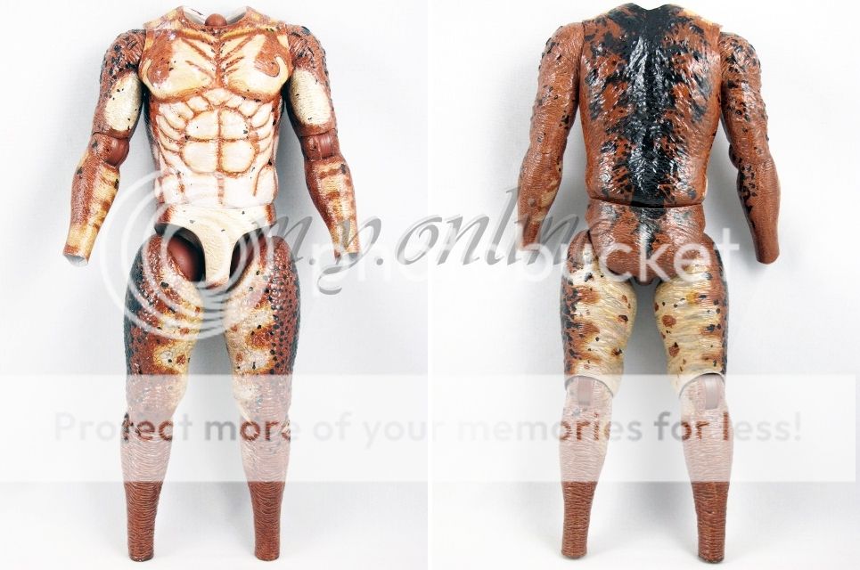
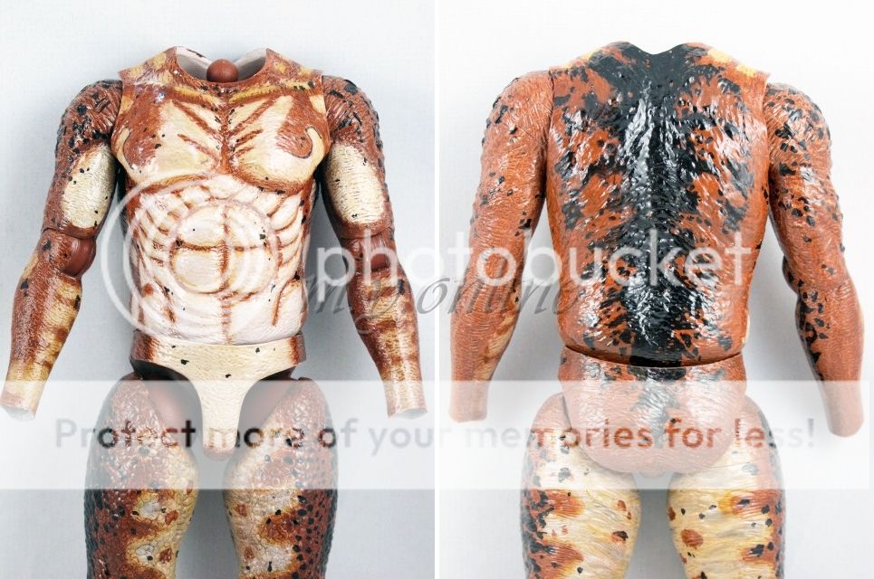
Taking Lost into account once again, it's not really a big deal once they're all displayed together. These Losties have outlandish designs and HT tried their best to replicate them at 1/6 scale.
Seeing as how paint is their strongsuit, I'll trust their judgment here. Just wondering if anyone else noticed anything odd about the bare body.