XM Predator by Narin

Collector Freaks Forum

Help Support Collector Freaks Forum:

This site may earn a commission from merchant affiliate links, including eBay, Amazon, and others.
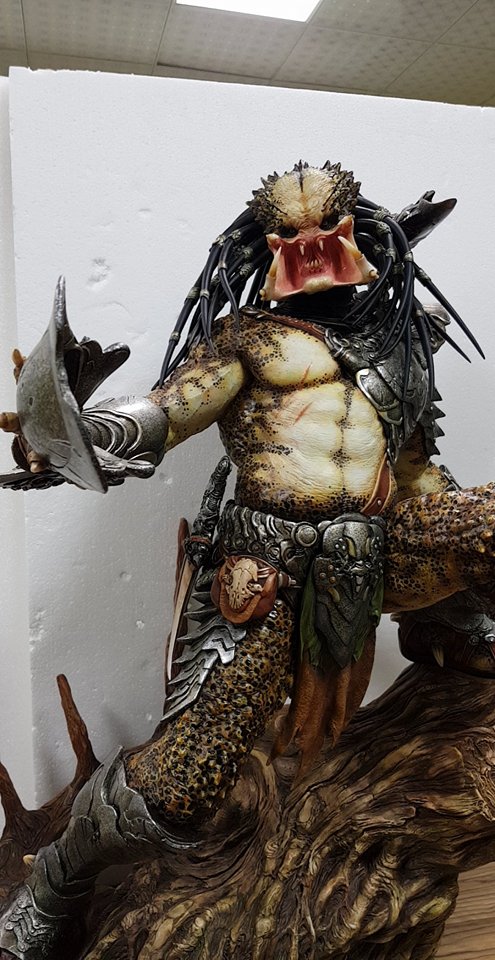
You guys still think the dreads look bad here? How would you like them adjusted?
attachment.php


Cheers Spike. :duff

The dreads should angle DOWN straight off the head...in this sculpt, the first angle is semi-horizontal and THEN they eventually angle down....that's not how gravity works--and more importantly how the Predator is supposed to look. All one has to do is take a look at the many BUSTS that are out there as well as the SWS' Predator...or god-forbid, the movie. So sad that after all this effort they missed the mark... :gah:
 
Looks pretty good to me, if not for the outrageous asking price I'd get it. Great looking piece. I did think there would be more green in the base though.

It's a ****ing monster space wise, and the box.
 
The dreads should angle DOWN straight off the head...in this sculpt, the first angle is semi-horizontal and THEN they eventually angle down....that's not how gravity works--and more importantly how the Predator is supposed to look. All one has to do is take a look at the many BUSTS that are out there as well as the SWS' Predator...

Yep,my perception aswell.Looks very unnatural to me.
 
The design has improved a lot with the changes introduced. Congrats!!!. However, there are a few points that might be easily improved by XM (already commented by you, guys):
1.- More natural angle for the dreads: that first semi-horizontal angle is the only (huge) drawback that is pushing me away from ordering it right now.
2.- More green color spread on the base: the appearance of some lichens would make it to look really fantastic (great contrast between brown and green).

As big fan and collector of XM, I know that XM Team could manage these changes easily and very efficiently. Please, guys, try to solve these issues (which are commonly agreed by many of us). Thanks!!!
 
I'm waiting for you to state what he problems is.

Sent from my SM-N950U using Tapatalk
 
I'm waiting for you to state what he problems is.

Sent from my SM-N950U using Tapatalk

Well if you want my opinion here it is. The head looks too small. The body looks a little chubby. The body should look more muscular. The lack of netting. Should have less stand and a larger predator instead. Paint is ok but could be better. For that price I could by a good used car!
 
Sorry I haven't been on the thread in a while guys. Here's a closeup of the base that shows the colours a bit better.

24852337_1966428543577835_4860516382950698259_n.jpg
 
Half the size of this statue is the stand! They could have made a smaller stand and charged half the price!
 
I would have to mortgage my home to buy this piece!
Well if you want my opinion here it is. The head looks too small. The body looks a little chubby. The body should look more muscular. The lack of netting. Should have less stand and a larger predator instead. Paint is ok but could be better. For that price I could by a good used car!
Half the size of this statue is the stand! They could have made a smaller stand and charged half the price!

You should probably go and buy a used car (AND RE-mortgage your home).


.
 
I think the bigger problem with the dreads is the scale of the dreads to his tiny crown of a head.
 
You should probably go and buy a used car (AND RE-mortgage your home).


.

I have a new car and a new home which are both bought and paid for. My point is that the amount of money they now want for these statues is getting ridiculous! Don't you agree or are you part of the 1%?
 
Back
Top