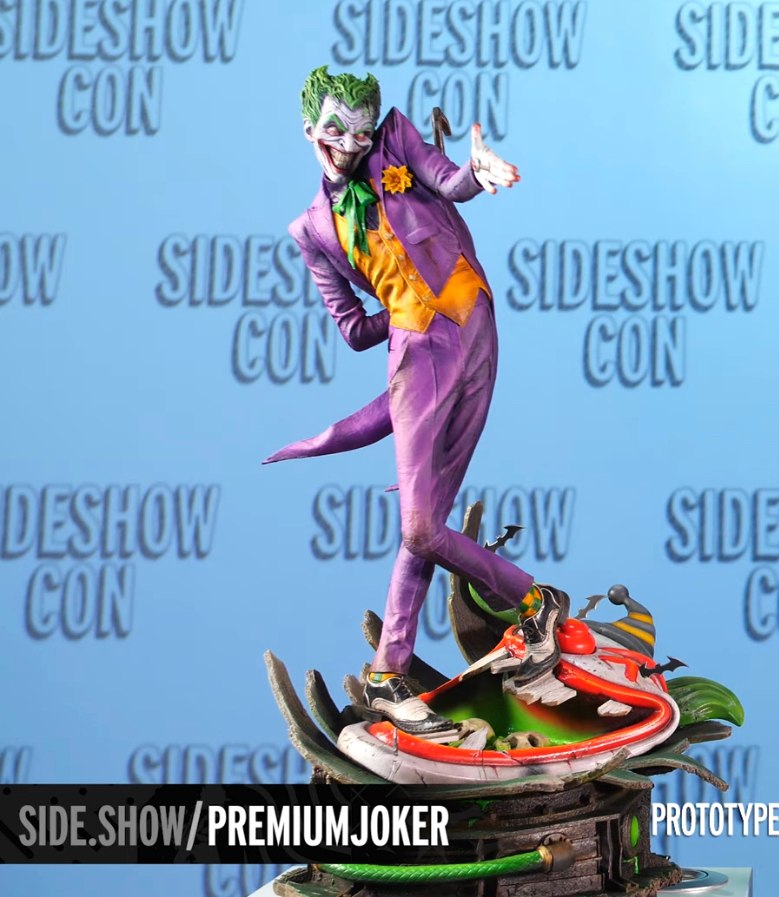
I do as well except it’s backwards. Very few people shake with the left hand. That’s just and odd thing to be the main focus of the piece. I suppose that offness is something they’re going for but with the awkward legs over that oddly designed tank of acid, it just seems off. Maybe better pics will sway me. It’s the best they’ve done since the original. That pogo stick one was awful. Wish they’d go back to using mixed media. This isn’t a premium format. It’s a statue. A maquette. Not premium. Just a format.