Hello.
I'm absolutely not a collector, but got this piece who really attracted my eyes.
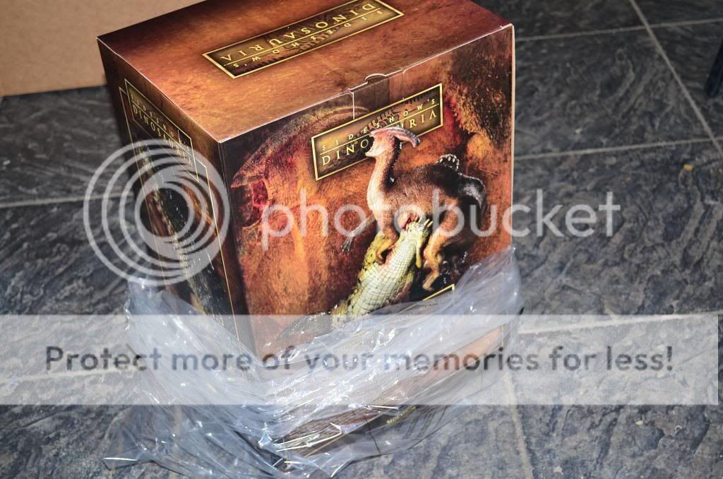
So, i got number 186 of 250.
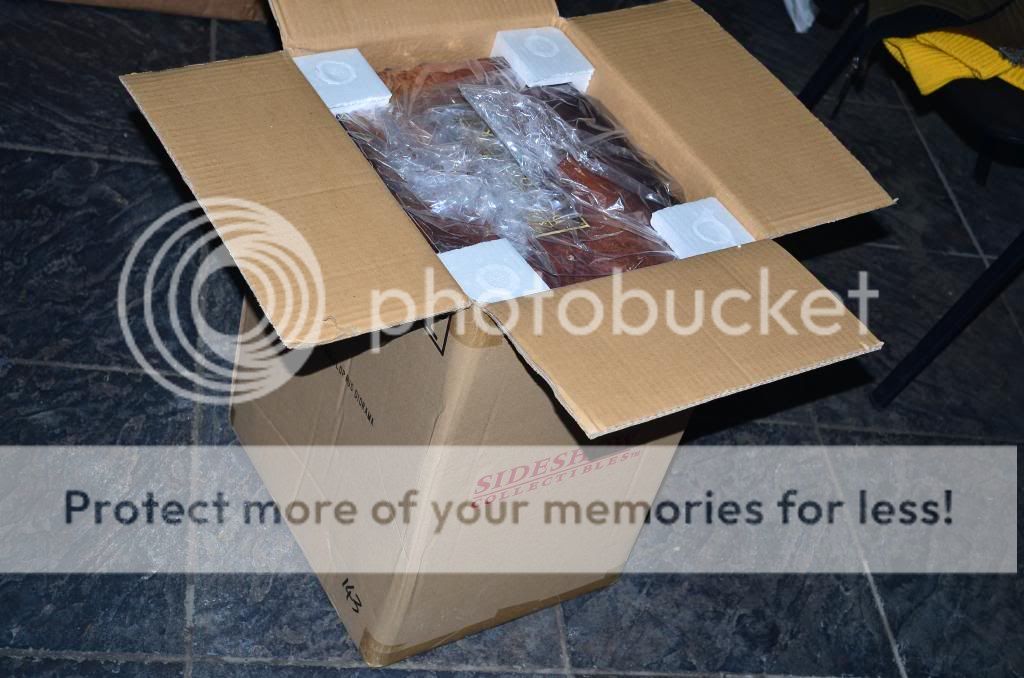
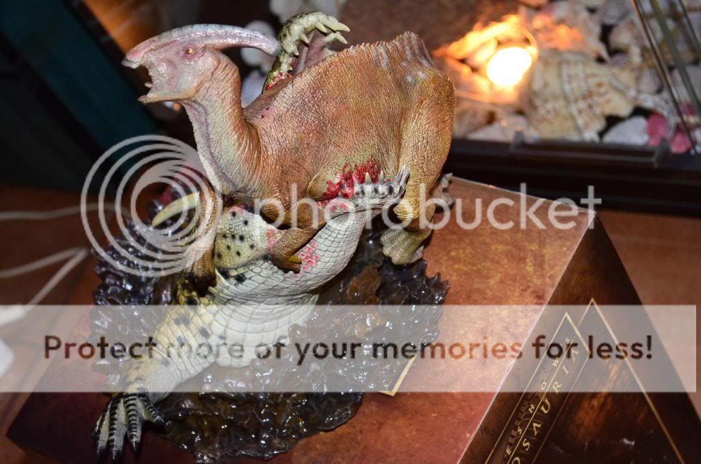
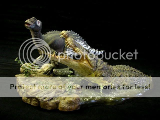
Unboxing, Waooo. That's big, heavy, this feel absolutely not cheap.
When you place and replace it on your desk, you have made your daily sport.
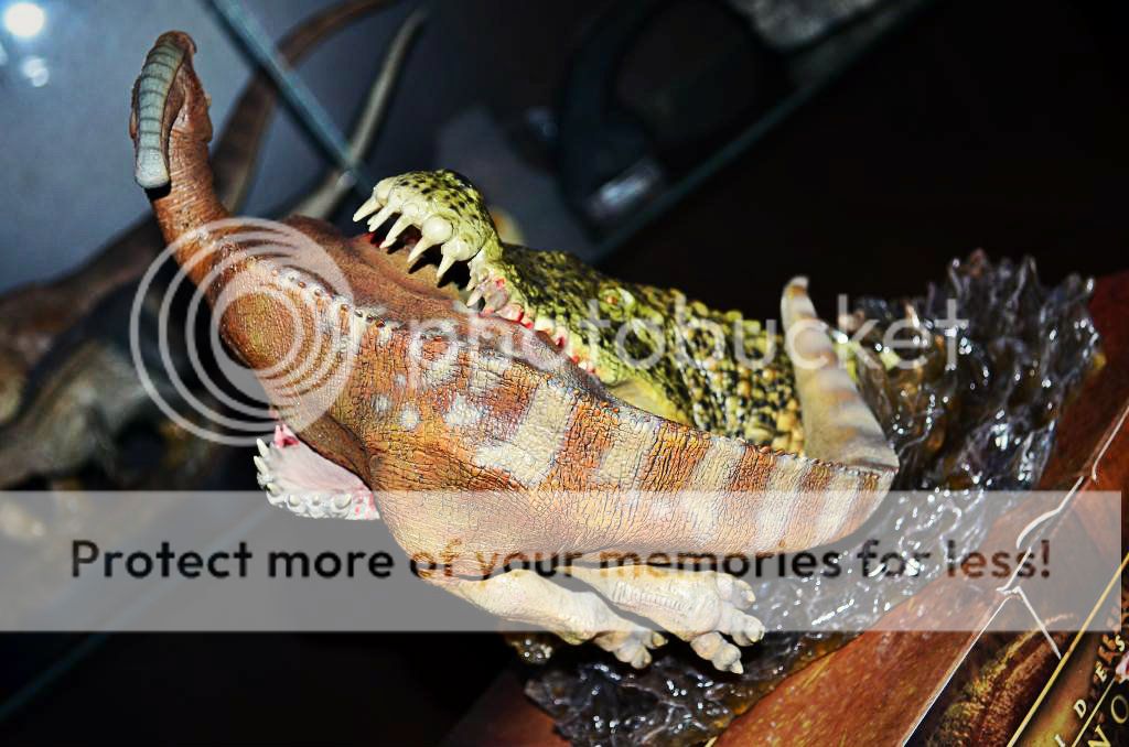
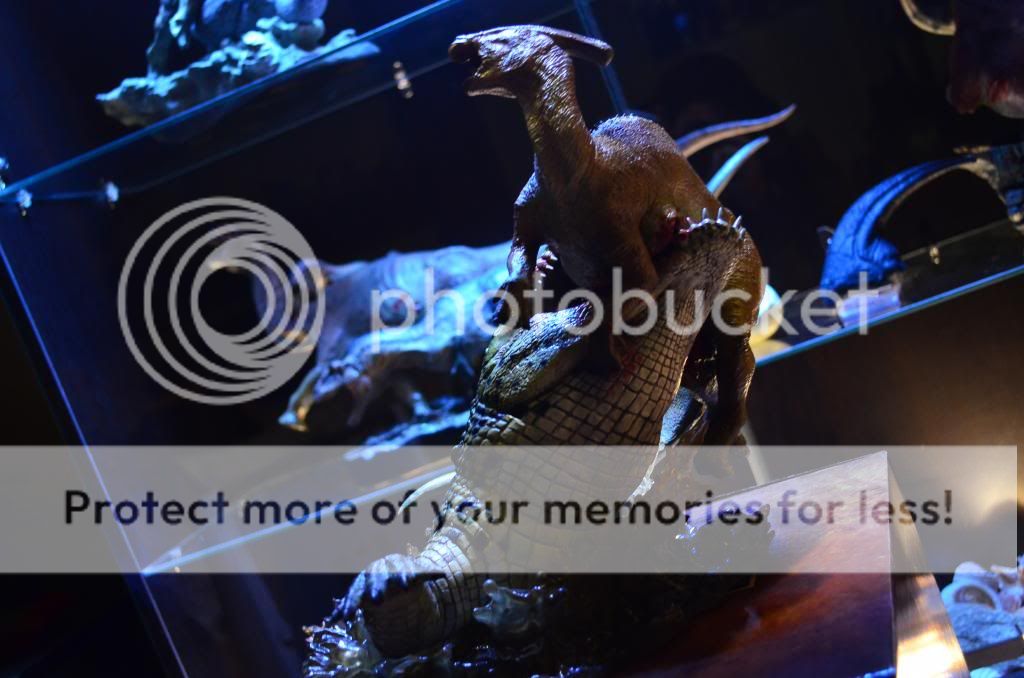
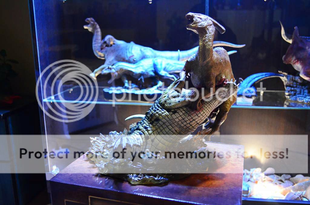
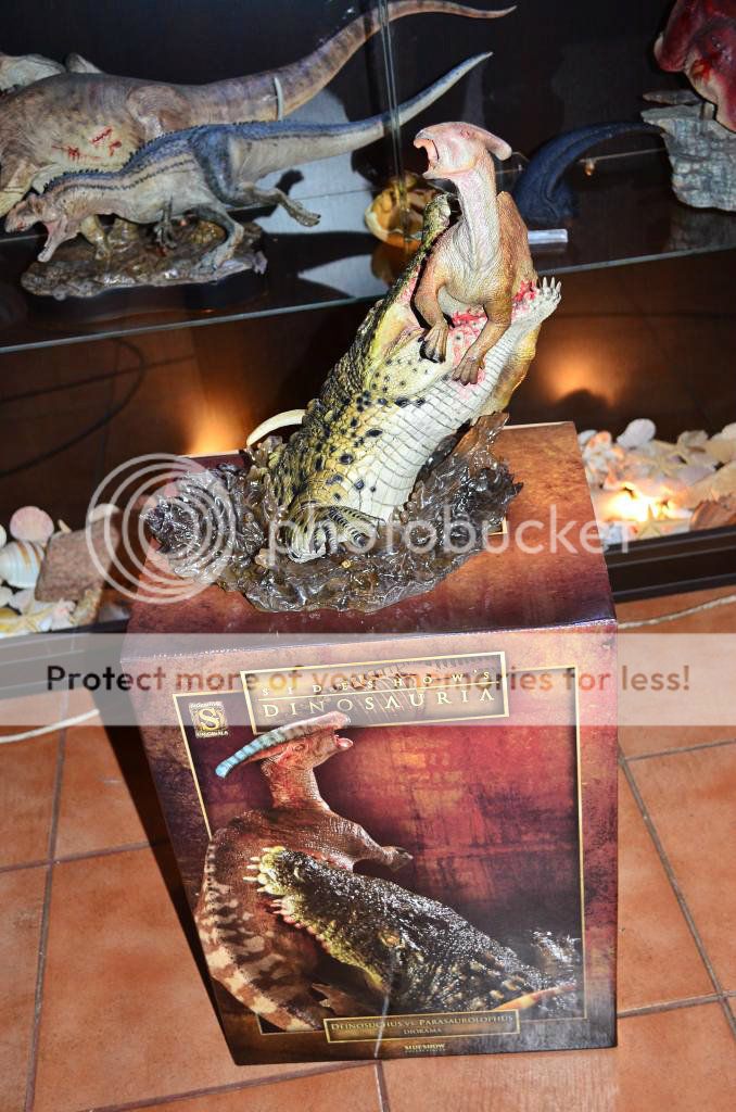
The sculpture itself : It's dynamic, something is happen. The reason why i bought it. Asymmetry, movement, relation between two objets or figures.
What's good here, it's the diagonal sculpt, the virtually unstable pose.
You see the past of the scene. You see the future.
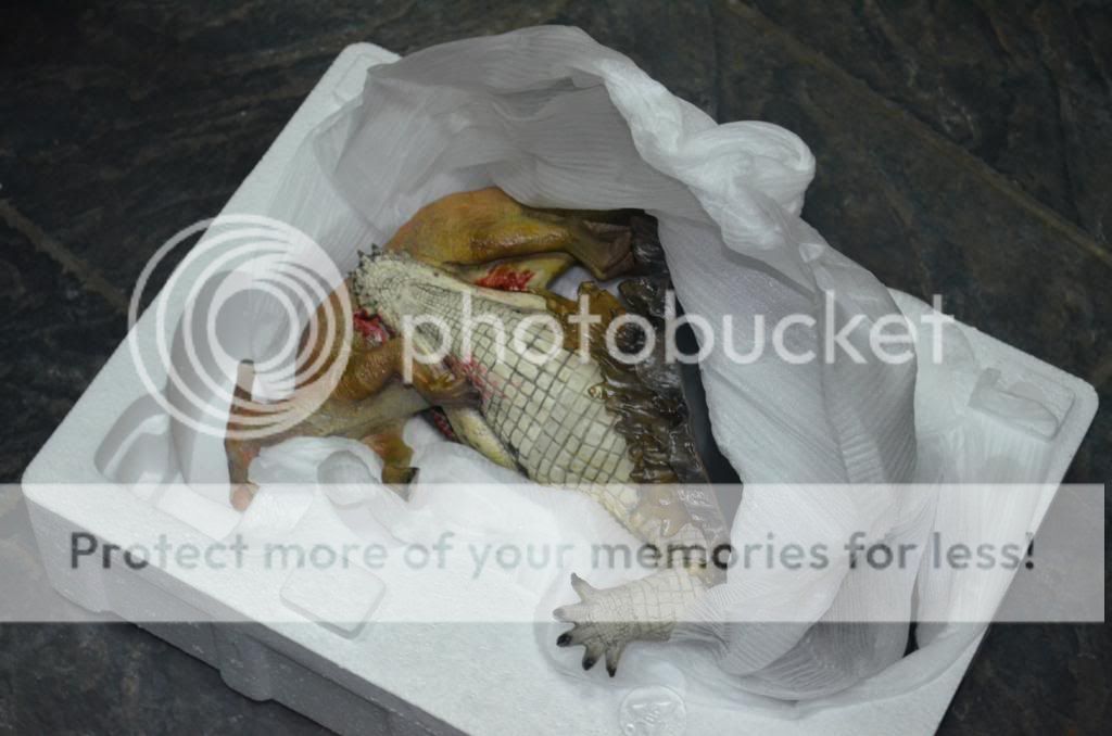
Nothing broken on my model.
Base looks ok, but would have been better with something around. Like stones, or a river border all around the water, someting minerals, or vegetal.
At least it's singular, recognizable. And it's a part of the whole movement. So, cool.
Mine (base) is dusty here and there, dont know if it's intentionnal.
Dont think so, but i see that on others people pictures...
Strange. It's like mix of dirt and glue. Can it be erased ?
Or is it a... feature ?
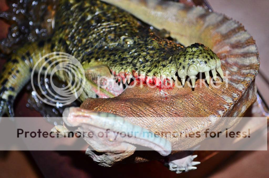
The croc is ok. I just know Deinosuchus, no more. Dot or no dot, dont really bother me. He is a little bit surcharged, the texturing is very dense, too much maybe, but, well, it dont bother me.
I love the fact the body is partially visible. The way the jaws are deformed, the impact he made on the Para body, the Porcelain looking belly.
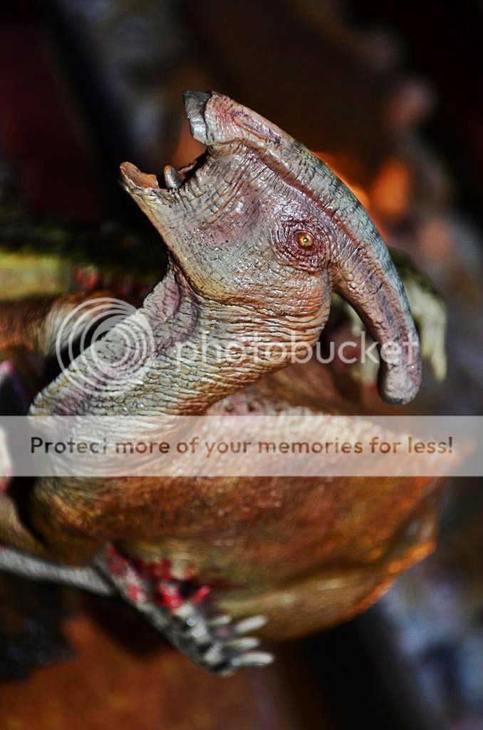
Paint is not the promotionnal picture, though. We see a sort of hurry or time limited work. Transitions are sometimes blurry specially on the Para. Colors lakes of depth and variations comparing the promotionnal pictures.
We can say this make the sculptures greater than the paint it is applied on, if we want to stay in the critisism. What i make, cause i think it's good to (try to) be objective, even if the impression is globally very positive for me.
The only disappointement i have is the near missing paint on somes Para nails. Higher hand is ok, but on the lower, nails are nearly the same color than the skin.
People wondered about blood. Me too, days ago. Finally, blood looks good for me, i mean the saturation, the colour itself.
Whole is more or less better depending lighting, but that's not the weird red i feared.
Then, i have some interrogations.
Specially, the eyes. they are made of gold. They are not translucide, they reflect in a uniform way, the lighting.
Strange, dont know why they made that. Dont look bad, dont look well, don't know. Just wonder.
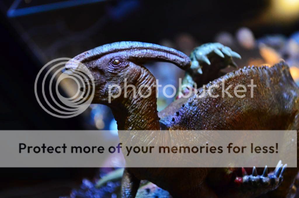
The Para colours :
In this scene, the Para is the extend of the movement, not the thing our eyes catch the first time. It's more than the second role, the first is play by the Deino. So maybe it's why they choose an unique colour variation for this para, rather than something more excentric.
But i'm not sure. Other colors, more hot, would have been maybe better, than a unique brown variation, even if the actual colour look very natural, realistic.
We can say it's a very common interpretation of the parasaurolophys. We are not in Dinosaur Revolution.
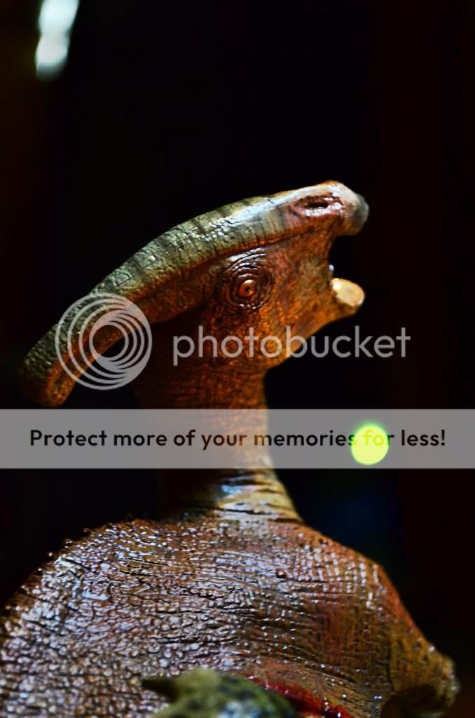
And... my main interrogation. The glossy finish.
He seems heterogeneous. The croc arm is entirely shining. Belly is not.
Dont know if the skin of croc retain water or not.
But i have an interrogation, looking at his dull belly.
I thought it will be entirely shining.
Will read you thoughts if you have some.
Well, i was long, too long for a such english quality.
But, eh, i discovered the piece here, so i wanted to give a feedback here in return.
Can't take good pictures actually, so here's just one.

")


 ...
...


 . I am very happy that slowly, I want to catch all these wonderful statues!