Eyes look too beady.My buddy sent me this photo which apparently was posted on facebook, so at least it looks like we will be seeing some better quality, colour balanced images. THIS is what JND should be putting out there to showcase the new portrait if they want to show it at it's best. The video lighting is horrible in that reveal video today.
You are using an out of date browser. It may not display this or other websites correctly.
You should upgrade or use an alternative browser.
You should upgrade or use an alternative browser.
JND Studios: Superman (Christopher Reeve) 1:3
- Thread starter Shoo
- Start date


Help Support Collector Freaks Forum:
This site may earn a commission from merchant affiliate
links, including eBay, Amazon, and others.
I think the irony here is that initially JND said all they were only going to do was fix the hair b/c the sculpt was fine as is. Too many ppl kept complaining that the sculpt was bad altogether, so they end up redoing it; but, now folks want the old sculpt back with the new hair 
GaryPool
Super Freak
I don't think they captured him well to be honest. The first portrait is better in my opinion, it has an essence of Reeve, although not 100 percent. This looks a bit better but has lost the likeness aspect. I feel like it's the mouth and nose area.
csutkakoma
Super Freak
This just shows to me at least that the new sculpt lost the soul of the character in the process. Just look at the eyes, the expression and put the statue next to these.a couple reference for consideration
View attachment 700707
View attachment 700708
View attachment 700709View attachment 700710
View attachment 700712
Glad I have no interest in this one. I really can't tell accuracy wise but I think as a sculpt I would want to look at for years to come I prefer the original portrait, if only it just had some tweaked hair and a less pallid complexion (though that could have just been the lighting too).
Let's be honest. JND has had way more misses with their sculpts than hits. I think collectors often confuse (or forgive?) how life-like they look--which I have little doubt most JND sculpts come across in person--with how accurate they look. I have the single Catwoman on order and am really excited about it, but I do think their cowled/masked sculpts are by far the best, which is not necessarily a track record I would boast about.
Let's be honest. JND has had way more misses with their sculpts than hits. I think collectors often confuse (or forgive?) how life-like they look--which I have little doubt most JND sculpts come across in person--with how accurate they look. I have the single Catwoman on order and am really excited about it, but I do think their cowled/masked sculpts are by far the best, which is not necessarily a track record I would boast about.
Agreed. I haven't been impressed even with the sculpts many others here like, other than perhaps Mera and Clark. And I feel like the silicone is often making the faces look droopy or sunken in. And this is yet another sculpt with a weird looking mouth.Glad I have no interest in this one. I really can't tell accuracy wise but I think as a sculpt I would want to look at for years to come I prefer the original portrait, if only it just had some tweaked hair and a less pallid complexion (though that could have just been the lighting too).
Let's be honest. JND has had way more misses with their sculpts than hits. I think collectors often confuse (or forgive?) how life-like they look--which I have little doubt most JND sculpts come across in person--with how accurate they look. I have the single Catwoman on order and am really excited about it, but I do think their cowled/masked sculpts are by far the best, which is not necessarily a track record I would boast about.
batfan08
Super Freak
It’s a really weird place to be in because I feel like I need to think about it in 3 dimensions. Bone structure, multiple angles; all the different aspects of our faces that change with weight gain, subtle shifts in expressions, etc. Because I very much like the face on the original prototype and I think it’s a lot more evocative of what I think of when I think of Reeve Supes. I also think those features and his eyes, in particular, make it a lot more lifelike, IMO. Despite that, with how gaunt it is and how sunken in the eyes are, it also felt a lot like that Hollywood Boulevard Superman that showed up on Kimmel all the time before he tweaked too hard and got himself stuck in a dumpster.I think the irony here is that initially JND said all they were only going to do was fix the hair b/c the sculpt was fine as is. Too many ppl kept complaining that the sculpt was bad altogether, so they end up redoing it; but, now folks want the old sculpt back with the new hair
Like, is it just easier to start from scratch or could they have just slapped some putty on those cheeks to beef that boy up and gave him a little hair cut? Because I like the proportions of the new sculpt a lot, in terms of the jaw, the head shape, and the hair, but the original face, itself, was so close to being where it needed to be that I almost wonder if people couldn’t ***** them into turning around a third time and combining the two.
I think that's a fair assessment. I only have 1 so I can't speak for all. But, from that one experience, I definitely see why ppl say photos just don't capture how accurate the sculpts may look in hand. There's just something that gets lost in translation from what the photos capture and what you see with your own eyes. But, I understand that's not something one wants to gamble on when thousands of dollars are on the line. I was worried and almost canceled many times b/c I was so unsure about my Cavill Superman order. Glad I didn't b/c I think the likeness of the regular sculpt blows away most Cavill Superman sculpts I have and seen, including the many customs sculpts I have on hand.I think collectors often confuse (or forgive?) how life-like they look--which I have little doubt most JND sculpts come across in person--with how accurate they look.
I personally think the gaunt look of the original was mostly due to the photos and lighting. He looked very pale in the original photos. That's 100% JND's fault for how they photographed their own product. I believe there are rough edits earlier in this thread (or maybe it was facebook) that gave it a more natural looking skintone, which fixed much of the "sickly" look it appeared to have. I really think the only things that needed fixing on the original was the hair styling, neck thickness and the size of the upper body, which they did fix on this new version, but unfortunately they changed the entire face expression along with it.It’s a really weird place to be in because I feel like I need to think about it in 3 dimensions. Bone structure, multiple angles; all the different aspects of our faces that change with weight gain, subtle shifts in expressions, etc. Because I very much like the face on the original prototype and I think it’s a lot more evocative of what I think of when I think of Reeve Supes. I also think those features and his eyes, in particular, make it a lot more lifelike, IMO. Despite that, with how gaunt it is and how sunken in the eyes are, it also felt a lot like that Hollywood Boulevard Superman that showed up on Kimmel all the time before he tweaked too hard and got himself stuck in a dumpster.
Like, is it just easier to start from scratch or could they have just slapped some putty on those cheeks to beef that boy up and gave him a little hair cut? Because I like the proportions of the new sculpt a lot, in terms of the jaw, the head shape, and the hair, but the original face, itself, was so close to being where it needed to be that I almost wonder if people couldn’t ***** them into turning around a third time and combining the two.
I don't think they'll edit it a 3rd time, though. As they mention in the video, they simply can't keep tweaking a product otherwise they'll blow their budget.
Last edited:
Yes, I find it very frustrating when I see these products lit so poorly and with filters. JND are all about hyper-realism, but their photo and video style doesn't showcase the products in a flattering way at all. Give me a naturally lit, how it will look in person photo any day of the week!
Resident Eric
Super Freak
Arnie Kim's still the best if you can afford it
Mandible
Super Freak
- Joined
- Jul 16, 2010
- Messages
- 3,307
- Reaction score
- 1,260
I personally think the gaunt look of the original was mostly due to the photos and lighting. He looked very pale in the original photos. That's 100% JND's fault for how they photographed their own product. I believe there are rough edits earlier in this thread (or maybe it was facebook) that gave it a more natural looking skintone, which fixed much of the "sickly" look it appeared to have. I really think the only things that needed fixing on the original was the hair styling, neck thickness and the size of the upper body, which they did fix on this new version, but unfortunately they changed the entire face expression along with it.
I've said it from the very beginning of JND, they don't know how to photograph their products to their full potential.
The first sculpt was definitely poorly lit and photographed - hence the awful skin tone and hagged eyes. Same thing happened on the Cavill, but that thing looks insane in-hand.
Mandible
Super Freak
- Joined
- Jul 16, 2010
- Messages
- 3,307
- Reaction score
- 1,260
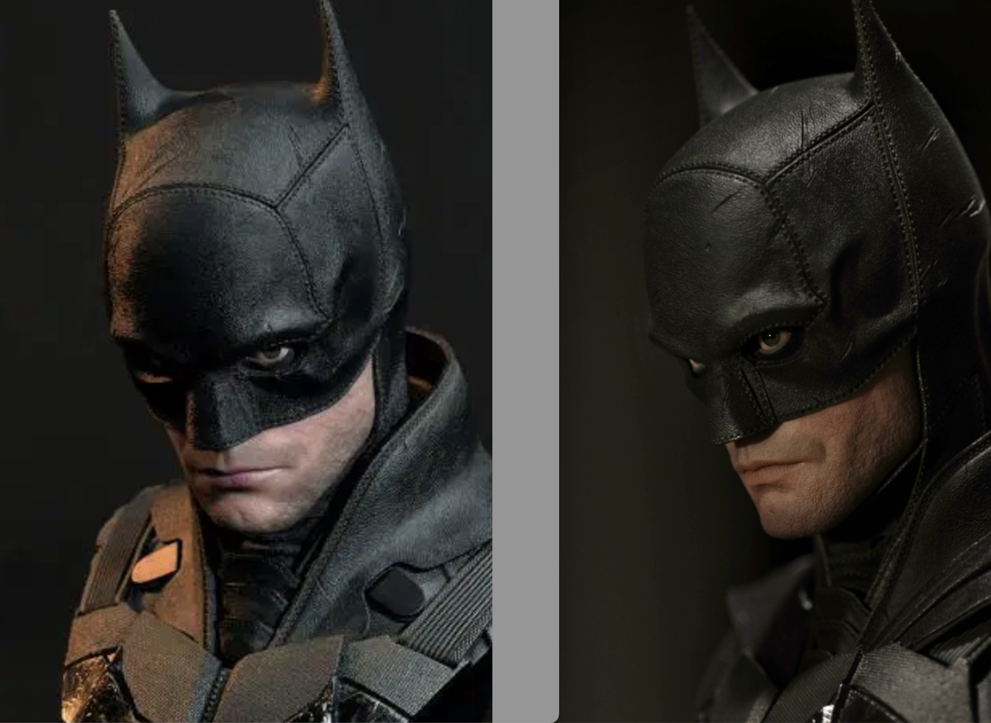
Here's an example. JND on the left, mine on the right. Look how dramatically different the mouth area looks - the lips don't even look remotely alike; it looks like different people.
Obviously the temperature is vastly different too, but again, that's lighting.
The other thing is in mine it looks alive, simply because of the light reflection in its eye (as a human eye would). The JND doesn't have that and so it comes across as lifeless.
Worst of all, I took that on my iPhone, and did 30 seconds worth of tweaks in the phone.
- Joined
- May 4, 2015
- Messages
- 2,679
- Reaction score
- 2,775
It's the EYES.
slynger
Super Freak
I was never getting this, but I think they missed on both attempts. I understand getting “close,” but at these prices that doesn’t cut it.
As already stated, Arnie Kim is the guy for the ultimate Reeve fan
As already stated, Arnie Kim is the guy for the ultimate Reeve fan
franpincho
lol@$300
Looks like a downgrade.
Money saved.
Money saved.
Resident Eric
Super Freak
Who will cancel their preorder here?
Attachments
-
 jndstudioscollectible_20240502_234618_9.jpg123 KB · Views: 0
 -
 jndstudioscollectible_20240502_234618_6.jpg116.4 KB · Views: 0
 -
 jndstudioscollectible_20240502_234618_7.jpg150.6 KB · Views: 0
 -
 jndstudioscollectible_20240502_234618_8.jpg116.5 KB · Views: 0
 -
 jndstudioscollectible_20240502_234618_5.jpg114.8 KB · Views: 0
 -
 jndstudioscollectible_20240502_234618_3.jpg87.7 KB · Views: 0
 -
 jndstudioscollectible_20240502_234618_4.jpg85.8 KB · Views: 0
 -
 jndstudioscollectible_20240502_234618_2.jpg90.4 KB · Views: 0
 -
 jndstudioscollectible_20240502_234618_1.jpg88.3 KB · Views: 0
 -
 jndstudioscollectible_20240502_234618_0.jpg128.1 KB · Views: 0


Last edited:
Mandible
Super Freak
- Joined
- Jul 16, 2010
- Messages
- 3,307
- Reaction score
- 1,260
The website photos are a thousand times better than the videos but it still looks like the Indy where on very certain angles you can clearly see the likeness, then from all other angles it's completely lost.
The biggest issue is still going to be the dual set - the sculpts are so vastly different now, it won't even look like the same person in any way They've even been so cheeky as to not do a new photo with them side by side on the base.
The biggest issue is still going to be the dual set - the sculpts are so vastly different now, it won't even look like the same person in any way
They've even been so cheeky as to not do a new photo with them side by side on the base.The sculpt isn't working any better for me in those shots. And the head actually looks a bit undersized now in that full body shot.
Mandible
Super Freak
- Joined
- Jul 16, 2010
- Messages
- 3,307
- Reaction score
- 1,260
The sculpt isn't working any better for me in those shots. And the head actually looks a bit undersized now in that full body shot.
Now that you mention how small the head is, I can't unsee it!
csutkakoma
Super Freak
This is a downgrade and a big disappointment. I am probably going to cancel this. It is not Reeve. The first sculpt was better.
Similar threads
- Replies
- 8
- Views
- 1K
- Replies
- 5
- Views
- 971
- Replies
- 0
- Views
- 593