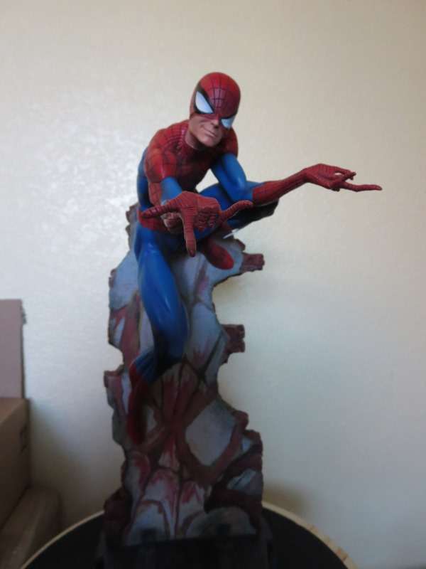
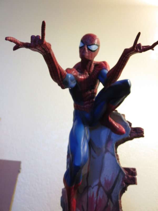
Totally agree. I was surprised how small box was. I do wish the paint was more like the proto, and if I had to nitpick I would have definitely preferred one piece, it's not a huge deal but I don't like the arm seams. But again, it's a small complaint.
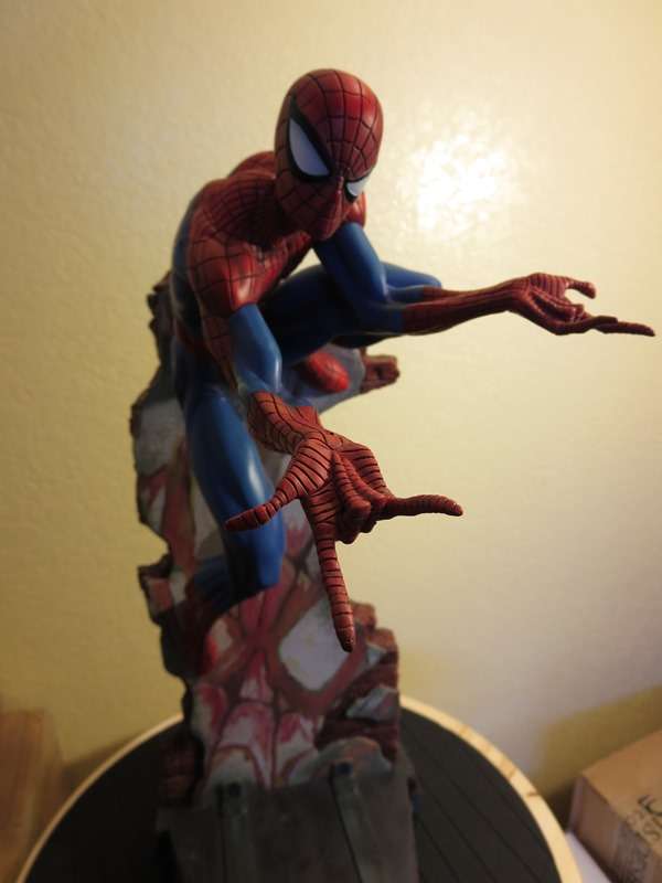
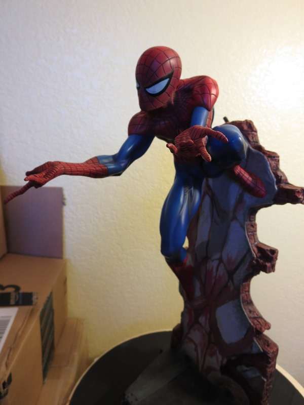
Mine looks great! The only small nitpick I have is that his lower right foot doesn't slot into the wall perfectly...anyone else have this issue? It's basically hovering a little and if it comes out, it moves to the side. Debating whether to contact SSC about that. Other than that he is perfect!
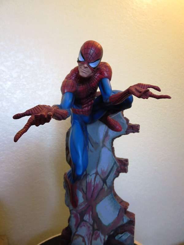
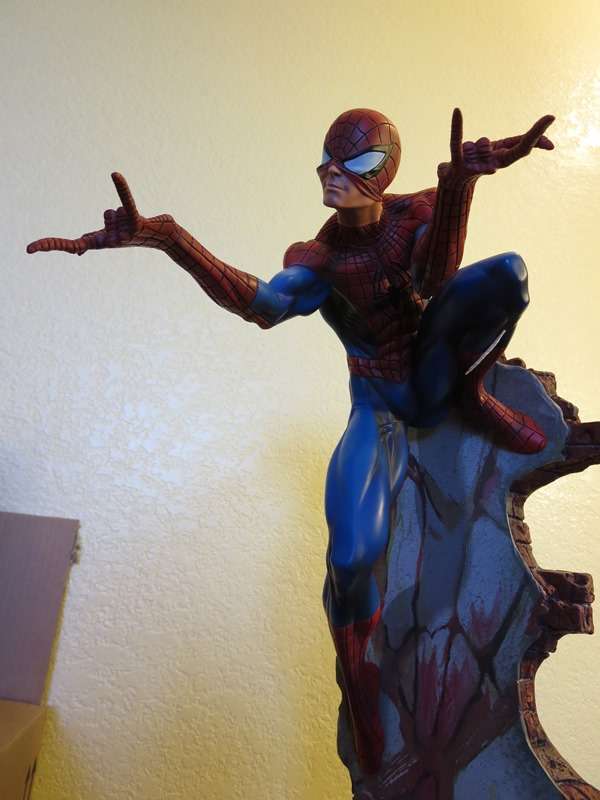
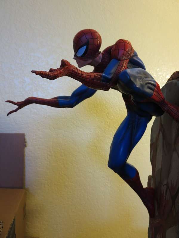
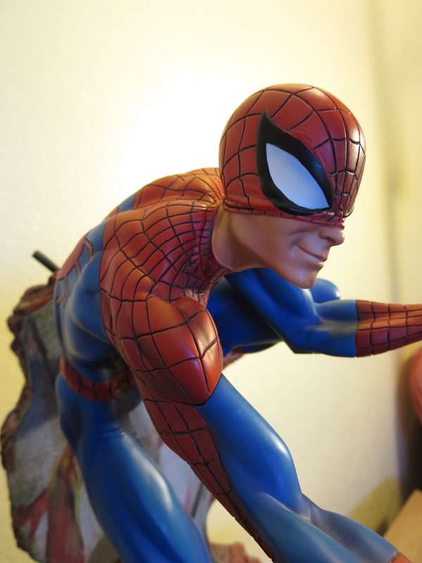
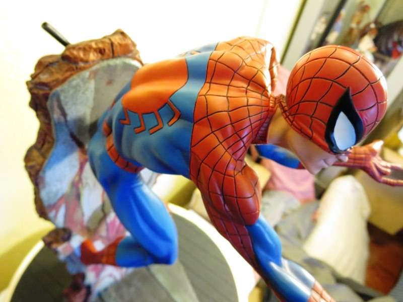
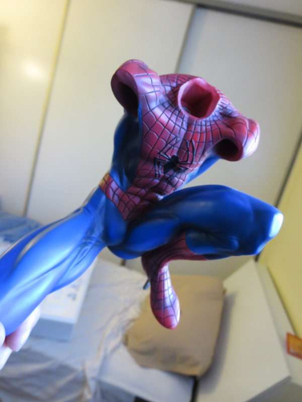
Got mines today, turned out great, clean lines and the colors are very similar to the original comiquette. Still like the original comiquette better because it's bigger and has more presence because of that fact but this is decent. I'm more dissapointed that SS chose such a similar pose and base when they could've went with something different
As good as this looks that is what would be pissing me off if I had bought this piece. The flat paints made the proto look unique, and made it consistent with the ladies. Now this just looks like a mini version of the Original Com.
As good as this looks that is what would be pissing me off if I had bought this piece. The flat paints made the proto look unique, and made it consistent with the ladies. Now this just looks like a mini version of the Original Com.
That's exactly what I was going to say.
The proto paints is what really set this apart from the Commiquette.
Now it's an almost an exact duplicate of the older spidey statue
That's exactly what I was going to say.
The proto paints is what really set this apart from the Commiquette.
Now it's an almost an exact duplicate of the older spidey statue
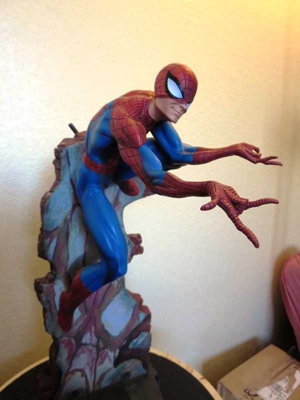
While I wouldn't say it looks exactly like the original, but it does look similar. Especially with the paint finish and lines being executed in such a similar way to the original. ATLEAST that is how it appears to me. The original flat paints were just better IMHO.
While I wouldn't say it looks exactly like the original, but it does look similar. Especially with the paint finish and lines being executed in such a similar way to the original. ATLEAST that is how it appears to me. The original flat paints were just better IMHO.
Still, it's a valid point. The main draw of this piece was the nice matt finish and the lighter pastel shades of red and blue. The red in particular seems more like a deep "Statue" red than the light comic book feel. This also had the benefit of making the sunken black pop out as opposed to now where the lines almost get lost into the sculpt.
I'll wait for in hand pictures though before I get shot down by the people that just love everything and then get called a hater. As is the way. It's still a cool looking piece.