Hot Toys - IRON MAN - MARK III PHOTO Thread

Collector Freaks Forum

Help Support Collector Freaks Forum:

This site may earn a commission from merchant affiliate links, including eBay, Amazon, and others.
I wished they could have done a more less serious RDJ sculpt for this. It seems to be a pattern with their human sculpt these days, the very dead serious look.

In the movie I don't recall him being so serious.
 
I wished they could have done a more less serious RDJ sculpt for this. It seems to be a pattern with their human sculpt these days, the very dead serious look.

In the movie I don't recall him being so serious.

HT probably would reserve that for V2 ala jack sparrow. But yeah, the only time I remember Tony Stark looking that serious is right before he took off to gamara, but he was drunk so that might have something to do with it. :D
 
So anyone have any idea how CSC is getting theirs? Are they getting them from asia or waiting for SSC's order to come in... I'm guessing the latter and that makes me sad :(
 
does any one know why 1 of the pictures on the prevous page has got a circle on it?
 
I have mine on preorder from Sideshow, and I'm patient on getting mine. Love seeing all these pictures though!
 
IMCLOSE3.jpg
IMCLOSE4.jpg
The only thing that gave it away was the plastic tab at the back. Thought it was the full size one. :monkey1
 
So anyone have any idea how CSC is getting theirs? Are they getting them from asia or waiting for SSC's order to come in... I'm guessing the latter and that makes me sad :(

I emailed them the other day and they said March, so the SS shipment.
 
I got mine today from Sunny (studiosunny) who I totally vouch for - this is about the sixth figure I've bought off him and always no problems.

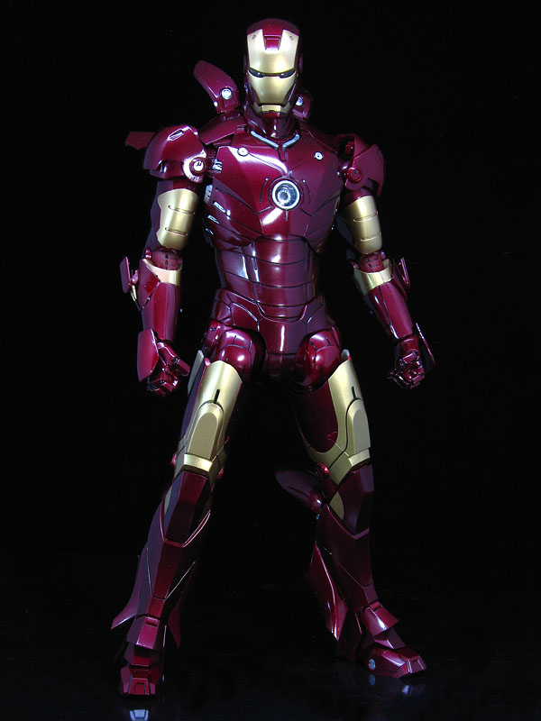
Someone mentioned a few pages back that the waist is too narrow. I agree, and that's why, although this is a wonderful figure, it's not, for me, as great as it could have been. It's like the difference between the Takara Batman and the HT original suit Batman - the HT one is better for a number of reasons, but the main reason for me is that the Takara Batman is too thin. It doesn't look like a man in a suit, and neither does this.

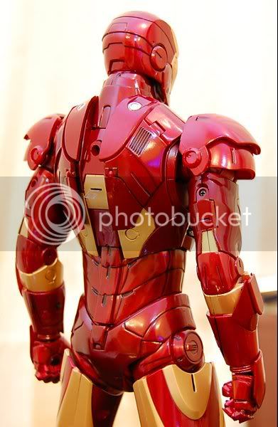
You can say so what, but what that means for me is that this figure looks too toylike for me; when you first see it on a shelf there isn't the wow factor of the HT Batman figures. This wonderful, expensive figure is capable of deceiving the eye into thinking its a badly proportioned Hasbro figure. For the wow factor you have to pick it up and examine it - look at all the slats and articulation, the amazing shoulders etc, the detail, and above all TURN THE LIGHTS ON because then it does look amazing.

My other slight criticism - that's criticism, not whining, because grown-ups are allowed to say what they think - is that the colours seem a little muted. They could be brighter, 'sparklier' perhaps. But this is a very subjective thing, and besides, if it had been brighter I might well have complained about it being too gaudy!

I stand by what I said about the waist - it makes the legs seem too long, and results in an unnatural silhouette seen head on. But that's it. Apart from that, this figure is a marvel of engineering and you can see someone put a lot of love into it.

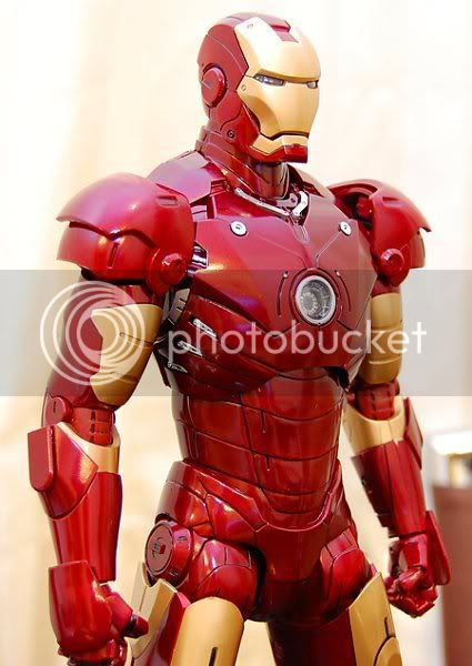
As for the stark head it's great (incidentally putting the Stark head on the figure makes you realise how out of proportion it is) but one of the eyes on mine was painted veeeerrry slightly off. Not enough to really piss me off but enough to irritate me.

The packaging is, of course, fantastic, although since I always bin mine it's not that important to me. But, a nice box to open and packaging junkies will adore it. It's not just the heart thing which is great, but the heaviness of the card used which gives it such a luxurious feel.
 
I thought I was going to be original when I was going to do that with my Tony head!

Oh well, at least the process is out there now which makes it easier for people who do want to do it! Can't wait for this to get to me!
 
Last edited:
I see a lot of comparing the figure to that early promo pic posted earlier in this thread. I think the design was refined and tweaked a bit from that image to the final look in the film. I have yet to see anyone comparing the figure to shots from the movie.

There's a lot of tricks going on with the suit to give it a certain kind of proportion. The shoulders and chest are very heavily built up, the waist/stomach is very close to the body. The legs are also narrow towards the front which makes the leg appear slimmer than it actually is (similar to the more recent iPods from Apple). Proportionally in the film the waist does seem impossibly slim. It's all tricks though (this being most obvious when you can see the actor's head inside the suit, it looks very small).

ironman05.png

ironman01.png

ironman02.png

ironman03.png


20090115024118906.jpg.jpg

20090115085604135.jpg.jpg

3198702041_a22acdd399_o.jpg

20090117103837977.jpg.jpg

img0987ch2.jpg

IMCLOSE4.jpg


Is the figure perfect? No, but it's pretty damn close. Closer I think than the TDK Batsuit. The waist I see no obvious huge problem, maybe the shoulders a touch too wide (as someone mentioned probably to retain articulation). The waist looks pretty spot on to me looking at screencaps and people's photos here.
 
Thanks for the pics, Dedguy. As the figure accurately reflects what was seen on screen then I can't argue with that - my personal preference would have been for a more 'realistic' body shape, but if that wasn't movie accurate then I think that would have been almost no one else's preference. The figure is near perfect.

Not sure about the colour - actually, it looks pretty accurate from your pics although toy colours are notoriously subjective as the reference material can vary from laptop to laptop (the 5" Doctor Who line is a particular victim of this).
 
Yeah, well just looking at some of those pics of the figure above the color is all over the place, the same is true of the suit in the movie. It varies a lot based on lighting conditions. It's gold and red, that's all I care about.
 
how can you even compare this to the overdone batman( just messing with batman fans..)...i am suprised werenot getting a winter or artic fraking batman by hot toys. just for the frak of it.i had to add frak.by the way when is this hitting..
 
it looks alsome to me. i don't have the time right now to sit down and watch the movie and play with my figure to see if it's movie accuarate yet, but i will oh that is cool.......i need a batmobile.....
 
Cool mod.. the only problem is the place where dude put the light up heart. It doesn't line up with the IM light up heart. Still a very slick mod. You can really see the height difference in this pic:

8a.jpg


IM is slightly behind Tony, which means if they were side by side the Tony light-up heart would be even higher. Slight error.. still cool looking.
 
I think part of the problem might just be body construction. There just isn't room for it lower.
 
Back
Top