You are using an out of date browser. It may not display this or other websites correctly.
You should upgrade or use an alternative browser.
You should upgrade or use an alternative browser.
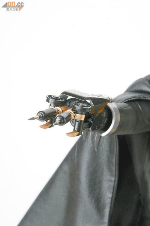
Hot Toys DX09 - BATMAN - Batman (Michael Keaton) - Specs & Pics
- Thread starter MaulFan
- Start date

Help Support Collector Freaks Forum:
This site may earn a commission from merchant affiliate
links, including eBay, Amazon, and others.
Guinnessfan
Super Freak
Looks great, can't wait to get this.
cokebabies
Super Freak
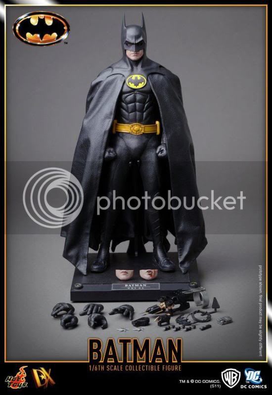
Much better. No idea why they light their stuff like that.
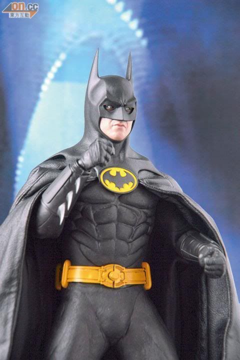
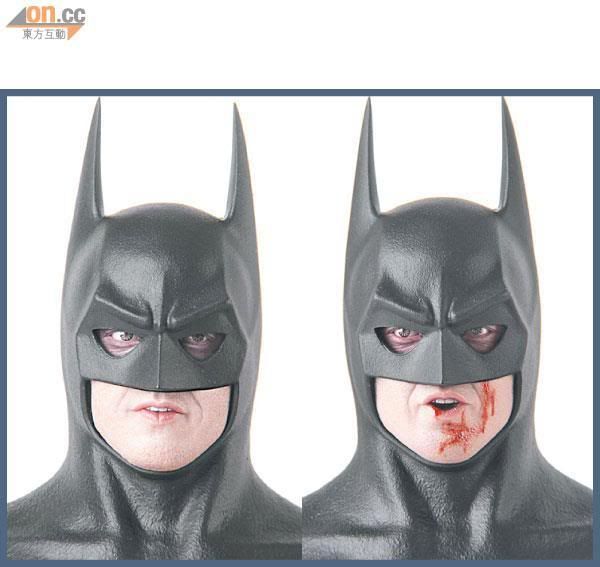
Yeah, you can see how harshly they're lit by the fact that his eye black is purple in the face close-ups. Rough.
batfan08
Super Freak
Yeah, you can see how harshly they're lit by the fact that his eye black is purple in the face close-ups. Rough.
What's hilarious are the people on facebook who don't understand what lighting is, and are pissing and moaning about how HT should change the color of his"eye makeup" from purple to black.


Cape looks pretty sloppy here.

Cape looks pretty sloppy here.
Yeah they could have done a lot better with that. Im assuming its the wire in the cape that poofing it out. Im mean there is a wire in the cape right? How else did they pull off those fully spread cape shots.
intothevoid
Super Freak
The wire in the cape is gonna be a pain in the ass to pose right judging from prior experience with the Medi TDK batman cape
What a imbecilesWhat's hilarious are the people on facebook who don't understand what lighting is, and are pissing and moaning about how HT should change the color of his"eye makeup" from purple to black.

Yeah, but still it's awesome feature Im0The wire in the cape is gonna be a pain in the ass to pose right judging from prior experience with the Medi TDK batman cape
Guinnessfan
Super Freak
Yeah they could have done a lot better with that. Im assuming its the wire in the cape that poofing it out. Im mean there is a wire in the cape right? How else did they pull off those fully spread cape shots.


Whomever took these should be fired. 1.) for horrible lighting 2.) not futzing the cape at all. 3.) using a white backround.
I can't wait to see OMG's pics and pics from fellow boardies who know the basics of lighting.
Last edited:
intothevoid
Super Freak
What's hilarious are the people on facebook who don't understand what lighting is, and are pissing and moaning about how HT should change the color of his"eye makeup" from purple to black.
I would happily punch each one of them in the face.
intothevoid
Super Freak
While these pics are absolutely terrible in terms of futzing and lighting, they give you a very very good indication of what the product actually will look like in hand as opposed to the done up promo pics.
And the indication i'm getting is that this is an absolute stunner.
And the indication i'm getting is that this is an absolute stunner.
- Joined
- Nov 11, 2008
- Messages
- 32,452
- Reaction score
- 3,147
While these pics are absolutely terrible in terms of futzing and lighting.
Yeah, it looks like they didn't even try to make it "look good". It's like they just put it up in over exposed lighting, without futzing or posing it and shot it.
Like you said though, the end result should be fantastic.
CollectorNC
Super Freak
- Joined
- Jan 27, 2011
- Messages
- 2,611
- Reaction score
- 1
AWESOME, just pure awesome. Looks great even in crappy pics.
intothevoid
Super Freak
My only criticism is that they could do better than that lazy DX stand.
For the DX01 and DX02 it made great sense, they replicated the stands that the movie costumes were on display on in museums and shows
Since then they've just been lazy and changed the texture of the base and not come up with anything original/applicable to the figures in question.
For the DX01 and DX02 it made great sense, they replicated the stands that the movie costumes were on display on in museums and shows
Since then they've just been lazy and changed the texture of the base and not come up with anything original/applicable to the figures in question.
- Joined
- Nov 11, 2008
- Messages
- 32,452
- Reaction score
- 3,147
My only criticism is that they could do better than that lazy DX stand.
For the DX01 and DX02 it made great sense, they replicated the stands that the movie costumes were on display on in museums and shows
Since then they've just been lazy and changed the texture of the base and not come up with anything original/applicable to the figures in question.
Yeah, I agree about these stands.
However, I don't think they're final. Look at the hands, they're painted casts. You can see the resin white base where you'd insert the hand pegs. I bet that plate stand is just a stand in, especially with that shoddy glue and all.
Remember the specs for the figure state a DX stand with name plate and the Batman movie logo and the pics of the stand we have gotten so far don't have the logo.
Similar threads
- Replies
- 44
- Views
- 4K
- Replies
- 573
- Views
- 58K
- Replies
- 15
- Views
- 998
- Replies
- 6
- Views
- 817
- Replies
- 112
- Views
- 9K


