You are using an out of date browser. It may not display this or other websites correctly.
You should upgrade or use an alternative browser.
You should upgrade or use an alternative browser.
Premium Format Christopher Reeve Superman the Movie Premium Format Figure
- Thread starter Darklord Dave
- Start date


Help Support Collector Freaks Forum:
This site may earn a commission from merchant affiliate
links, including eBay, Amazon, and others.
Dr Sanchez
Super Freak
That pose is truly awful, hopefully we will get a 1:4 Reeve from PCS or Chronicle some time in the future that truly does this legend justice.
That angle just highlights the weird chess piece underneath.Looks pretty good form this angle")

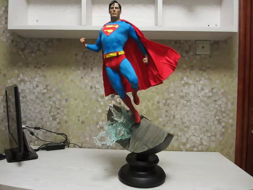
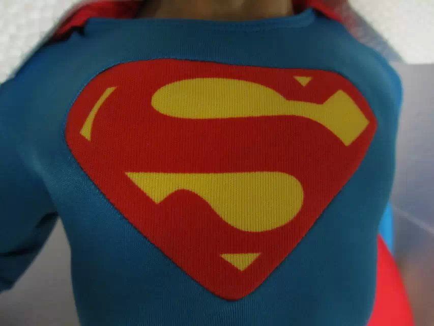
From the pics above the head looks way to big for the rest of the sculpt, and after looking at the more pictures link I can honestly say that the "S" shield looks like it was stitched in by a 5 year old. They actually messed up the iconic shape of the shield getting it in there. Every corner is blunted and the boarder is inconsistent.... and no it wasn't like that in the movies
From the link above
I defended this piece really hard before, but damn it let me down

Looks pretty good form this angle
Oh my God, hahahaha! Since I started collecting, this is truly the #1 worst PF I've ever seen. Everyone says that it's actually close to the proto. Yeah, but we all know how dreadful that was before these pics came out.
The way that chest logo looks is too funny, man. The whole thing's gotta be made of PVC with a foot peg that small. I wouldn't even go as far as to say it looks good in the the last pic I quoted, seeing how cheap and wrinkled the cape looks.
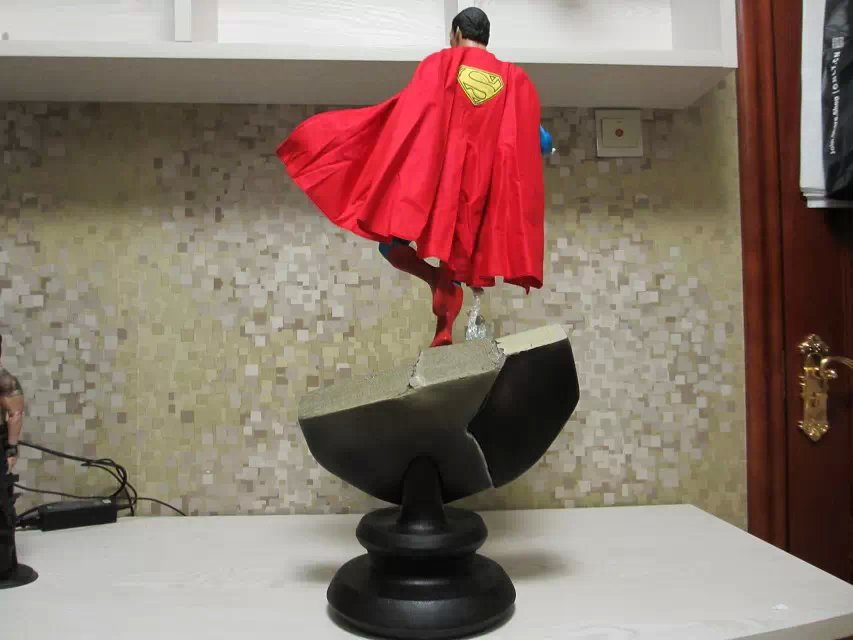
Speaking of the cape, the logo on it looks like a patch to me. Besides knowing how bad the proto was, I'm noticing some differences between the proto and this particular production. The first is the logo on his cape. Looks like patch.
Secondly, is the gap between his belt and the bottom of the logo. There's so much blue space between there.
Lastly, are his trunks. They're not flush and/or below his belt. I wonder if they can be pulled down at all? Look at the proto pics to see what I'm talking about. Horrible PF.
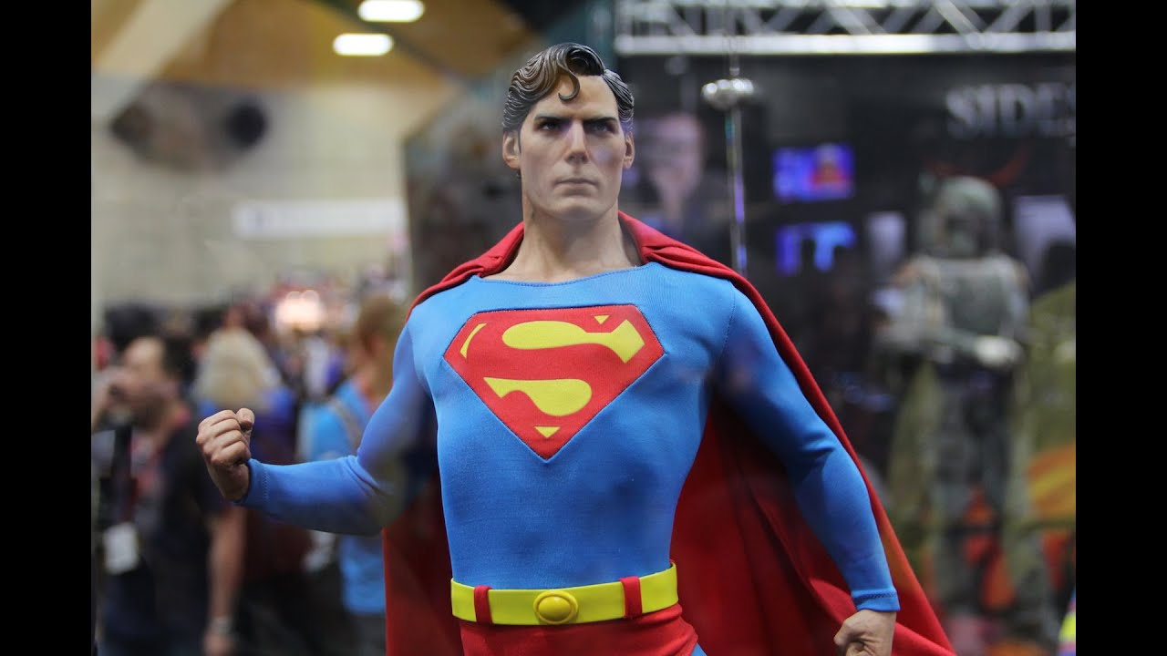
Proto pics...

While I don't forgive the S shape on the chest being off, I think a lot of the other issues that you bring up are all down to proper futzing BobaNerd.
-Wrinkled cape? water treat it, steam it, iron it, futz it.
-His belt and trunks? Adjust them and futz them.
The rest of it actually looks pretty accurate to the prototype. Now whether or not you like the prototype is all up to personal preference. I particularly don't like the design they went with. I would've like them to do an arm up straight like he's taking off pose/flying pose. I also don't really like the chess piece base.
But again, those are personal design dislikes from the start. Overall, I think this piece came out relatively accurate to the source.
brucecamblzchin
Waitlist 4 lyfe
The emblem is a worry, keeping mine though.
- Joined
- Apr 9, 2007
- Messages
- 5,314
- Reaction score
- 4,412
Still time to pick this one up, Supes fans!

There is no way that just the head on this is PVC since the head and body are all one piece, or look to be above the neckline of the suit. I'm guessing the whole body is PVC and light as a feather to help support the pose. The only thing poly is probably the base. Not that there's anything wrong with the choice of mixed media used. Personally I don't care for the look of a PVC statue, but that's just my personal preference. What is most disappointing to me is the extremely poor stitching of the emblem. The most iconic and recognizable aspect of the character and they screw it up. Hopefully the whole run isn't like that. Really disappointing piece as a tribute to Reeve, IMO.
Spidey976
Super Freak
Still time to pick this one up, Supes fans!
The fact that the MOS is the better of the two movie PFs makes me think that of I was involved with either of them as a member of the "Design" department .... Well

Irvy
Super Freak
A fitting monument to a turd of a movie.Still time to pick this one up, Supes fans!
While I don't forgive the S shape on the chest being off, I think a lot of the other issues that you bring up are all down to proper futzing BobaNerd.
-Wrinkled cape? water treat it, steam it, iron it, futz it.
-His belt and trunks? Adjust them and futz them.
The rest of it actually looks pretty accurate to the prototype. Now whether or not you like the prototype is all up to personal preference. I particularly don't like the design they went with. I would've like them to do an arm up straight like he's taking off pose/flying pose. I also don't really like the chess piece base.
But again, those are personal design dislikes from the start. Overall, I think this piece came out relatively accurate to the source.
Still time to pick this one up, Supes fans!
QuiGon, at this point, it looks as if MOS might be the better buy between the PFs. I'll have to see more in-hands, though.
Marker, you might be right about futzing the trunks. I just hope for the ones who have this on order that the whole suit can be futzed. The trunks definitely need it, however.
The top of the suit also needs it. The logo, even though it's completely sewn in like ass, seems to be off-center. Like the suit needs to be pulled to the left and then pulled down in order to center it.
By doing that, this owner might have enough slack to pull the sleeves down closer to Reeves' wrists. The trunks need to be pulled below the belt line, if the owner is able to do that too.
I agree, the cape looks as if it can be straightened with a steamer. I still don't like the patch logo (assuming that's a patch).
I'm just spoiled by how Sideshow treated Keaton's cape. It was folded so perfectly in it's own Styrofoam compartment. They didn't do that with this cape...more than likely because it can't be removed? I don't know.

mattman6886
Super Freak
I'm fairly confident that the emblem issue is primarily a combination of much needed futzing (the collar is most definitely pulled up and to the left) and lens distortion. Same goes for needing to futz the belt/trunks. Aside from that, looks like the prototype to me, which to me isn't a disaster by any stretch, just a bit off likeness wise. I personally like the pose and the dam base, but they could've went with a crystal fortress of solitude style thing for the bottom base instead of the black "chess piece".
dan350zr
Super Freak
doesnt look premium at all! looks like something you buy from a kids toy store.
To release a statue this bad on purpose says a lot about the company.... This should of been scraped at the beginning and redone....
To release a statue this bad on purpose says a lot about the company.... This should of been scraped at the beginning and redone....
A lot of us have been saying that from day 1
Spidey976
Super Freak
To release a statue this bad on purpose says a lot about the company.... This should of been scraped at the beginning and redone....
A lot of us have been saying that from day 1
When I first saw this I disagreed entirely, but I was wrong. This should have NEVER happened.
this is just a theory but I believe SS purposedly delayed Sinestro to coincide with the release of this hideous thing..Sinestro came out good so it will overshadow this release a little bit or will make us feel that yeah SS still produce good quality stuff..maybe this is just another miss..but still! very unacceptable! Especially for us international collectors who have no choice but to preorder these things and we cannot return them easily.
I can't blame you, I held out some hope it would be changed slightly to look good before shipment up until these pics. I really wanted a PF of him, but sadly this is not it.When I first saw this I disagreed entirely, but I was wrong. This should have NEVER happened.
Similar threads
- Replies
- 2
- Views
- 342
- Replies
- 0
- Views
- 685
- Replies
- 0
- Views
- 504
- Replies
- 0
- Views
- 579
Latest posts
-

-

-
 InArt - Ron Weasley 1/6 Collectible Figure
- Latest: Chopper Face
-

-

-
 Hot Toys: 1/6 scale Iron man mark III constructible version
- Latest: Berry The Music Man