Building your MARINES - CORRECTLY

Collector Freaks Forum

Help Support Collector Freaks Forum:

This site may earn a commission from merchant affiliate links, including eBay, Amazon, and others.
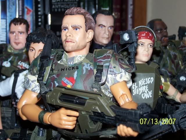
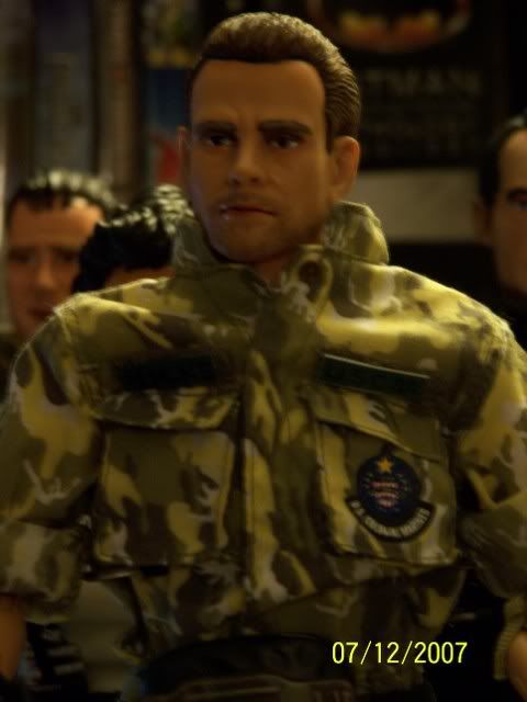
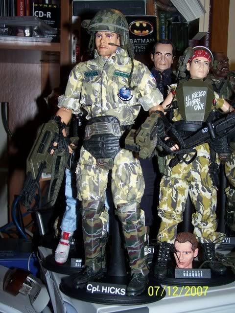
Hi Maulfan. What scene is that from the movie showing the back of Hicks' armor? I don't recall seeing that shot, but I'm sure it happens very quickly. I wish I knew how to do screengrabs from DVDs. How do you do it? Let me know. What do you mean by "DANGER"? Did someone think that Hicks had the word DANGER written on the back of his armor? You say in your previous post: "but you can see it's no on Hick's armor". Do you mean that the word DANGER is NOT written on the back of his armor? I just want to be sure because I want to paint my Hicks armor as accurately as I can to how it looked in the movie. Since I am using Hudson's armor, I am repainting it all to look like Hicks' armor did. Thanks! :D

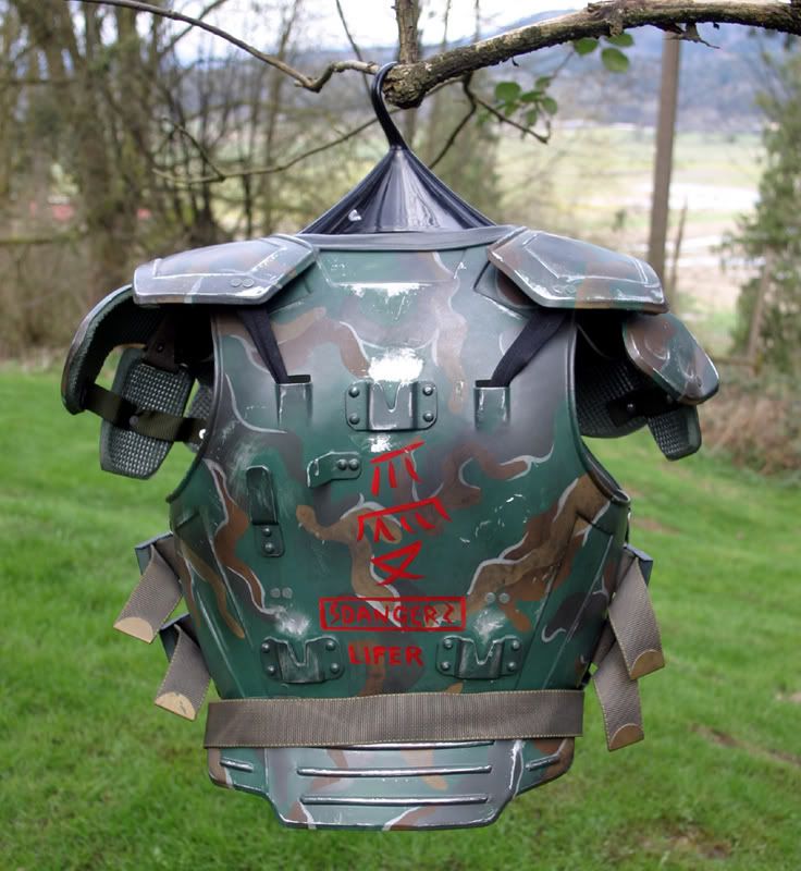
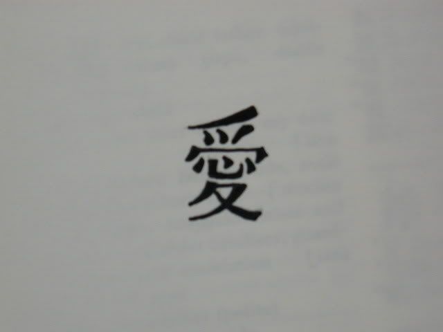
Mike, I use software called SnapNDrag, but I'm on Macintosh and I don't know what options there are for PCs, which I'm guessing you're on. As for what scene the snapshot's from, it's just as Hicks grabs Burke to kill him for letting the face huggers loose and then the Aliens cut the power and break in. All of the back armor shots are fast and split second, I got 2 moderately clear shots, including the one I posted, so I'll proably either skip the red decoration or fudge it. As for the Danger, if you look between the oriental graphics and the LIFER text on the back of the replica armor I reposted a picture of, there's a rectangle in red with the word danger inside it with an electric bolt on either side of the word, but based on the screen grabs I could get of the back, only the graphics and Lifer are present, the danger block doesn't appear to be on the armor.
 
Thanks Maulfan. I'm not sure what DVD screen grabbing software or tools for Windows-based PCs are out there. I'll have to look into it. I know some other member has posted some screen grabs in another thread with details of Hudson's armor and helmet graffiti from the movie. I forgot who it was who posted those screens.

I'll take note of what you've said about that graffiti on the back of Hicks' armor. I'll do what I can to replicate the stuff on the back of his armor. I'm hoping to find a "pin vice" to put the hole in his armor on his left shoulder and write "born again" around the hole in silver...possibly a silver Sharpie pen.

Hey Jedimike, Mudshark seems to have answered your pinvise question, so that's good. It's what I used to drill out the hole in my Hicks armor and it's actually a useful hobbytool to have around. Any craft or hobby store should be able to set you up with one. Here's an image;
pinvise_o.jpg
 
Nice detective work, MF. Your screen grab shows everything we need, imo. It doesn't look like "DANGER" is there at all, and "LIFER" is clearly white, as you say. The Japanese character "AI" (for LOVE) looks smaller and more correct in the screen grab. It's still hard to see if it has any strokes missing, but I'm guessing that it's written correctly. (The repro isn't, btw, and the spacing looks a little off, too.) I'll try to post a pic of the correct character for comparison, so check back a little later.
 
Nice detective work, MF. Your screen grab shows everything we need, imo. It doesn't look like "DANGER" is there at all, and "LIFER" is clearly white, as you say. The Japanese character "AI" (for LOVE) looks smaller and more correct in the screen grab. It's still hard to see if it has any strokes missing, but I'm guessing that it's written correctly. (The repro isn't, btw, and the spacing looks a little off, too.) I'll try to post a pic of the correct character for comparison, so check back a little later.

Definitely will be keeping an eye out for that text image if you can get it. It is smaller in the film for sure, but the blurred strokes even look different than the repro. I'm curious what that repro was painted based off of.
 
I've been eyeballing the movie paying close attention to the detail on the back of Hicks armor and Maulfan is absolutely right.

The word LIFER is written in white dead center between the two lower mounting brackets.

There is no DANGER motif at all as far as I can see.

The red Japanese symbols are clearly threre but they are blurred and grainy throughout. Hopefully Mudshark can sort that one out for us :)

Maulfan, if you can take grabs of the following shots it should help clear things up.

* Right after Ripley sets off the fire alarm in Medical, Hicks leans over the console to see whats going on. In the first few frames you can clearly see the lower back of his armor - LIFER in white, no DANGER motif, Japanese symbols though hard to make out.

* Hicks grabbing Burke as you mentioned.

*When Hicks wedges his rifle into the airshaft mechansim to grab Newt, a quick overhead shot shows his back armor

* After Newt falls down the air shaft, there is a quick glimpses as Hicks and Ripley run down the stairwell.

*A few blurry glimpses as Hicks and Ripley head for the elevator after Newt is grabbed by Alien.

All these shots show the Lifer in white and the Japanese symbols, but no Danger motif at all. I would take screengrabs of these shots myself but I dont have dedicated software.

I actually have the console shot you mention already, before the alarm goes off. I went frame by frame through Hicks dragging Ripley to the elevator, none of those frames were in focus enough to be worthwhile. I'll have to check those gun jam in the shaft with New moments for something, but I went through the whole film last night and took about 30 screen grabs to get various views of the armor even for weathering, and the already posted shot and console shot were the 2 clearest I found of the back of the armor. As far as weathering, I went for matching location and style from the film in some areas, and in others just made it up and I'm really happy with how it came out, I'll try to get some good photos of it later. What I like most is the metallic paint I used would go on thin in some areas, so it gives the illusing that the camo is only mildly warn away in some areas and in others looks completely warn away. It's painstaking to add all the weathering, but it was fun too. The most tedious part I found was weathering all of the hard edges because with anything, those are the areas where fading occurs most. I hope I can get his footgear and cod weathering done tonight, but I won't be home until later so I'm not sure.
 
Sorry I'm late, but I've got something that will hopefully solve the Japanese (or Chinese) character issue... Btw, I'd like to point out that it is supposed to be just one character (the word love). The way it was copied onto the repro armour kinda makes it look like several small ones.

This was done in some haste, but it should give you something solid to go by. The actual character on Hicks' armour may not have looked exactly like this, meaning the brush strokes may not have been this thick, but as long as all the strokes are there and it looks like one character, then you've got it! Anyway, hope this helps. :D
P1010377.jpg


And here's something out of my Japanese kanji dictionary...
P1010375-1.jpg
 
Thanks Mudshark. Knowing the definition of what a best guess of the symbol on his armor is, makes me think that probably is the correct symbol. Having bright red LOVE on the back and the bright red heart on the front would seem a fitting relationship.
 
Thanks Mudshark. Knowing the definition of what a best guess of the symbol on his armor is, makes me think that probably is the correct symbol. Having bright red LOVE on the back and the bright red heart on the front would seem a fitting relationship.

I would certainly agree. Besides that, there's really very little else it could be, based on what's painted on the repro armour. Nothing else comes close to it. I'd (almost) be willing to bet my Ancient Pred that this is the correct character.:lol
 
I would certainly agree. Besides that, there's really very little else it could be, based on what's painted on the repro armour. Nothing else comes close to it. I'd (almost) be willing to bet my Ancient Pred that this is the correct character.:lol

Well the more investigating I do, the less and less credible that repro becomes. Lifer is the wrong color, danger is on there for no apparent reason, and the character is poorly written.
 
A little warning to everyone customizing a Hicks, the paint used on the back of this replica isn't entirely film accurrate. I'm in the process of gathering reference images to touch up and weather my Hicks armor, and I've just come accross a still that I can post later, which shows the "lifer" text to be in white, I'll see if I can find a frame regarding the graffiti. Just wanted to share the heads up.

TE_Hicks_Back.jpg


Ok, so, not having any lucky getting a clear shot of the back artwork, but I did get a clear enough shot to see what the composition is on the back of the armor. It appears like the replica characters are correct, just larger than in the film, and I don't know where the DANGER section came from, but you can see it's no on Hick's armor, just the red characters and the white lifer text.

aliens_screen1.jpg


I contacted Terry English who made this Hicks armor and the original for the movie. I wanted a set. He makes them out of aluminum. A thinker at 5K.
 
WOW! Customizerwannabe, you were able to contact the ALIENS armor creator, designer Terry English! Very cool! We should pick his brain for all the armor details we can get from him to help improve our armor painting to get it as accurate as we can. :D

After looking at my extra Hudson armor that I'm using for Hicks that space on the back to fit the word "LIFER" is VERY small! I'm wondering how I am going to get that word in that space? Any ideas? :confused:
 
Last edited:
I like the Apple Barrel color paints too. I use them. I prefer them more than the Folk Art paints. Folk Art seems to come out of the tubes really lumpy to me! I'll get that pure silver color you're using. I"ll get a fine, maybe a "O" brush for the LIFER on the back of Hicks' armor. I'm having trouble finding a "pin vise" to create the hole in the Hicks armor on the left front shoulder pad. I want to put that hole there, and write "born again" around it to get it to look like his did in the movie. Since I'm using an extra set of Hudson armor for my Hicks, I'm having to paint all of Hicks' armor graffiti on it. I got the padlock and metal clasp superglued now over the red heart on the front of Hicks' armor. I got the clasp and lock from Chris at EVA and it looks great.

So, Maulfan, are you hitting all the corners, edges, and "high points" or raises in the armor to give it a more "aged" look? Let me know some tips on how you are painting the armor with that silver color to look more worn out on your Hicks. Thanks!

Just trying to keep the figure construction stuff in here since we have this thread too. I started with adding silver to areas like you mention because that's just where fading occurs with any object, on the edges. I then added some areas going off of film stills to get some wear in areas that showed on screen, and then added some subtle spots in areas where I felt a little wear and tear would make the armor look more real. I'll probably touch up with a second coat in areas because the first coat is transparent out of the light, which I kinda like a little of because it give an illusion that the camo is only somewhat faded away, but I do want spots where it looks permanently gone.
 
Thanks Maulfan for the painting tips about the armor. I plan on doing that like you are doing now with my Hicks, Hudson, and Apone armor. I'll take what you've said and apply it to my painting. I still have to get some of that "pure silver" acrylic paint for the wear on the armor. Check out a picture of my "kitbash" Hicks. I made him using pretty much all of Hudson's armor, and on the Hot Toys Kyle Reese body with the bare hands. I preferred to use a figure with bare hands since Hicks never wore any gloves in the movie like some of the other marines did. I also used a custom-made resin clasp and padlock from Chris C. at EVA Models to go over the red heart on Hicks' armor. I wrote HICKS above the heart in fine point black Sharpie pen. Yeah, it doesn't look as nice as the smaller "stenciled" type for the names that Hot Toys did, but it works for me. I put the repainted Hudson for Hicks head on him now. I will switch the head out with the much better famous "Stoner" head after I get it in the mail any day now. Check out my pictures and let me know what you think of my Hicks so far. Thanks! :D

Hicksandthemarines.jpg


100_5155.jpg


100_5140.jpg


The following picture has Hicks with an extra Hudson body with the gloved hands before I got in the Kyle Reese body today with the bare hands. I also put on "Cpl. HICKS" on an extra Hudson stand for my Hicks using press-on letters. I think it looks decent enough.

100_5144.jpg
 
Nice work Mike, your Hicks looks great!!

It must have been difficult to remove Hudsons graffiti without removing the camo paint underneath as well. How did you go about doing that, it looks superb. The heart and clasp looks perfect, just like on the production Hicks figure.

I would suggest you put the gerber knife on the other side of the bandolier and attach it by wrapping it in black electrical tape. That what I did with my Hicks figure and looks alittle more screen accurate.

hicks_knife.jpg
 
Coming along well Mike, I'd recommend repainting the skin and eyes on the Hudson head though, the HT painted mustache on Hudson throws off the head for any person, but especially the Hicks conversion, same for the eyes, but if you're happy with it that's what counts.
 
Hi guys. Thanks for your many kinds words about my Hicks. Oh man, I put the Gerber knife on the wrong side? Yeah, and I superglued it on his harness right above where all the hand grenades go in. I hope I can get it off of there safely without harming the armor that much! :confused: Do you have any suggestions for removing the superglued knife from Hicks' armor? Please let me know here. Thanks.

Well, the Hudson for Hicks head is just there until I get in my awesome "Stoner" head, that I'll repaint as Hicks. I should get it in at any time now. As for removing Hudson's armor graffiti, I used a very fine sandpaper and then came in with some colors after that to try to match the camo. I didn't get it perfect, believe me! I may even go over some areas again in the camo paint colors. But next, I'll "age" the armor with some pure silver paint on the edges and high parts of the armor to make it look more wore down and realistic as it did in the movie.

I may end up using the original HT Hudson head for Pvt. Weirzbowski (his name spelling? I never can get it right!). I have 2 Hudson heads, one with the original HT paint job on it now, and this one I repainted some for Hicks. I remember Weirzbowski had dark hair and Pvt. Crowe had blonde hair. So, I may end up using an extra Dragon head I have for Pvt. Crowe. I'm getting in an extra Ripley body that I'll use for female marine, Pvt. Deitrich. The fun part there will be finding an existing HT, Dragon, or BBi female head with a "buzz" cut haircut like Deitrich had in the movie!

Thanks again guys. I'll make that adjustment with the knife. I'm also going to put one of the Gerber knives I got from Chris at EVA on my Hudson's armor and one one Drake and Vasquez's legs close to their boots. Let me know if you have any ides on how to remove the knife I have on Hicks' armor now since I superglued it on. Thanks again! :D
 
Last edited:
Okay, I just removed the Gerber knife from my Hicks' armor with an X-Acto knife. It came off pretty easily since I only used one drop of superglue. I'll get some black electrical tape soon, and put the knife on the left side, the "correct" side of Hicks' armor. Thanks again for the tip STENDEC! Thanks for your help as always too Maulfan! :D


I'm still trying to find that X-Acto brand "pin vise" to drill the hole that the words "born again" go around on my Hicks' armor. No luck finding it down here at Hobby Lobby! They didn't have any idea of what I was talking about?! Even with a picture of it in my hand to show them. Wow. That's disappointing. Maybe Wal-Mart or some other crafts store may have it? Let me know. Thanks again.
 
Last edited:
Back
Top