Statue BLITZWAY- Enter the Dragon- Bruce Lee Tribute 1/3 scale Statue Ver. 2 spec

Collector Freaks Forum

Help Support Collector Freaks Forum:

This site may earn a commission from merchant affiliate links, including eBay, Amazon, and others.
Something I wonder will be lucked out again on another ETD piece even if that piece hypothetically has everything else perfect.
It's usually the likeness that sucks on otherwise nice figures/statues.
The pose is also great on this and probably a one off.

To be honest I don't see another ETD piece being made for a long time. 1/6 figures have been done, a 1/4 statue, now a 1/3 statue. I just don't see anyone bothering to make one, not for a long time, but I think if they do it'll be a 1/4 piece, not 1/3.


I've been studying Bruce Lo's pics again... and to be honest I kind of felt this from the start...I'm not sure he has repainted the body apart from embellishing the cuts. The paint still looks fairly even in his shots and I see the same subtle pink tones in his also present in xplOsive's pics - they are just less prominent because of the strategic lighting. He can correct me if I'm wrong but I think xplOsive has lit his shots (along with a stylistic aesthetic), to gain maximum musculature definition and maybe some of the more subtle shading and colour differences in the skin tone you see in Bruce Lo's pics are being sacrificed somewhat.

I'm glad I'm not the only one that thinks this, lol. You are right, when I take photos of this, I do use the light to gain maximum musculature in the photo as I think it looks better when done so. It can alter the colours somewhat, but the sculpt is a little soft in comparison to the proto, so if it's not lit up properly it can end up looking smooth/soft in the picture sometimes. Using the light to my advantage makes the statue look more realistic (to me) as the muscles pop more. I do try and capture the colours also though, so I try and strike a balance.

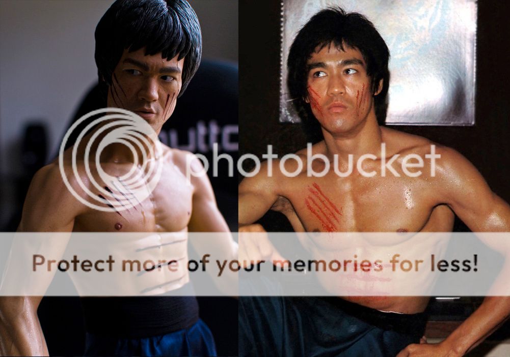
These really look like the same to me as what you are seeing in the less shadowed versions of xplOsive's pics. The skin tone is still fairly flat with some subtle pink accents that are coming through because the piece is more thoroughly lit. I really think it's coming down to lighting and the fact we are dealing with a translucent resin that is absorbing or reflecting light differently in every shot and every environment. And it should be said, for low quality pics, Bruce Lo's do look much better than most of the other phone camera pics we've seen but I feel it's more of a jag with the lighting. The lens pointing up from that angle in his shots could also be having an affect on the exposure off the skin and how it is being represented. I think it would also look (unfairly and misrepresented) a flat yellow in a different room, under different lights and with a different camera even. So maybe Lo's low grade pics are, by way of fluke, actually showing off the paint job in its truest sense to anything else we've seen rather than him repainting the thing. Just my opinion. Maybe he could confirm all this anyway?

This is pretty much spot on mate. I agree about the pics, and I would say Bruce Lo's pics look the most natural because he probably took them in natural light where it actually does look like that, whereas other guys probably took their pics in an artificial light setting with yellowish lights. Lighting really does have a great effect on this piece, and it does look it's best in natural light where if the room is filled with bright sunlight, it will take on a more natural, lighter skin colour with pinkish tones, but if it's overcast he looks more tanned.
 
I'm now pretty sure that the cuts will be redone when I get mine,when it gets here i'll have a better idea what I can do(there's several ways to go about doing this)
the sweat is another thing,if it's not overly noticeable in hand I may just leave it as is,(same with the head seam),but a thin line of putty then paint would look a much better finish and maybe a consideration.i am/was one of the guys who said that this sort of thing was something that should not need doing,but I want this to be an accurate and best ETD statue made(and it is my last)so I'm prepared to do some touch ups,then get my (artist sis in law) involved,if needed to touch up/blend the paint correctly should I feel I couldn't do it correctly.
 
I am surprized you took yours back, the jaw line is the last thing that bothers me about this piece. I would be more concerned if it was like nongshim's one that is leaning like moon walker (another Sideshow statue trade mark).

I would have happily taken Xplosive's statue. Popcultcha offered to replace my statue so I have to post it back to them. I think any flaw on the statue can be overlooked except for the lean.
 
I think these photos of the statue taken in natural light and the image of Bruce off set and away from studio lights, match up pretty well for skin colour and shading.

It's a wonderful unofficial shot of him, reveals a lot of detail and a reflective moment captured in time - plus it is pin sharp which is not usually the case for most sourced ETD pics. Both images are fairly even in base colouring without stark fluctuations in the skin tone. I agree with xplOsive's comments regarding extra superficial shading within the base flesh tone is likely to move the piece towards feeling less natural and more airbrushed. Most pictures of Bruce show his skin to be evenly toned in colour across the board so I think Blitzway have probably got this right, knowingly or not. The reddish tan base colour looks very good in natural light and that is the most important thing. Perhaps the most subtle shading to help delineate muscle structure could help depending on how you plan on lighting the piece but it wouldn't need much and I probably wouldn't use paint to do that job either, more like a powder or something to retain the translucency.

I think these shots also marry up well in terms of musculature. The shot of Bruce off set and relaxed is not as ripped and feels closer to the look of the statue.

And this shot gives a pretty good look at just how basic the make-up was for the cuts. Most people who can hold a brush should be able to replicate cuts that are 'accurate to the film'. Bizarre how BW have got these so wrong, and I mean, they are not even the right colour which is not exactly hard to copy.

28_zps7njhmdll.jpg
 
Looks good from the "normal" display angle. Not overly keen looking from the right headsculpt is impressive though.
 
Thanks for posting new pics. Looks good from the same angle as promo shoot. No distorted arms ,no lean. Agree head sculpt looks good.
 
Looks good from the "normal" display angle. Not overly keen looking from the right headsculpt is impressive though.
Look at the art work on the box Chris , yay Blitzway got the scars right .:fireworks:fireworks
It's got to be done in a brush stoke way not even pen marking .:lolimage.jpg
 
Back
Top