Hi Guys,
Sorry for the lack of responses from me in this thread, I've been busy with work.
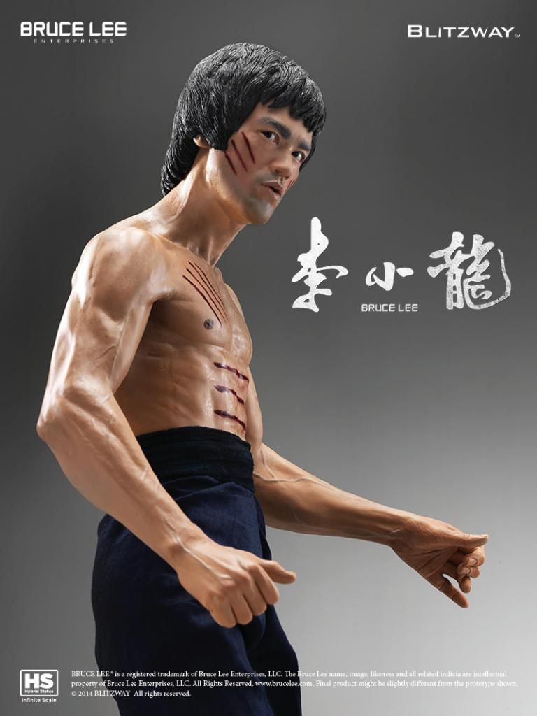
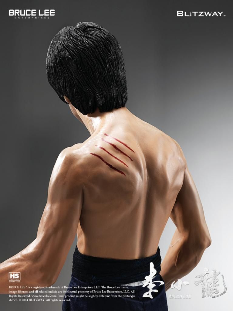
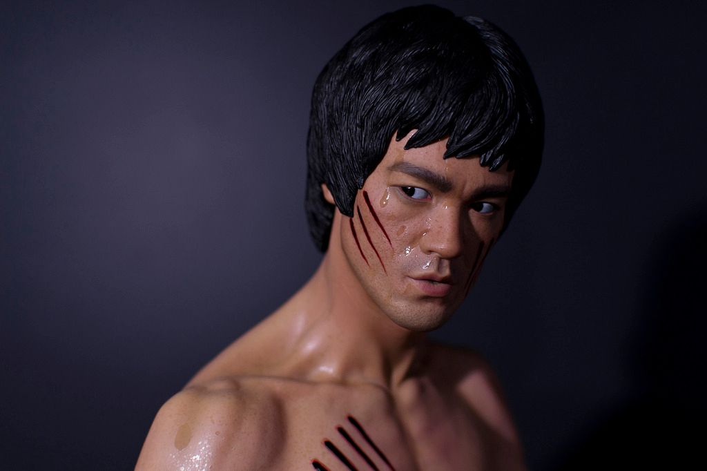
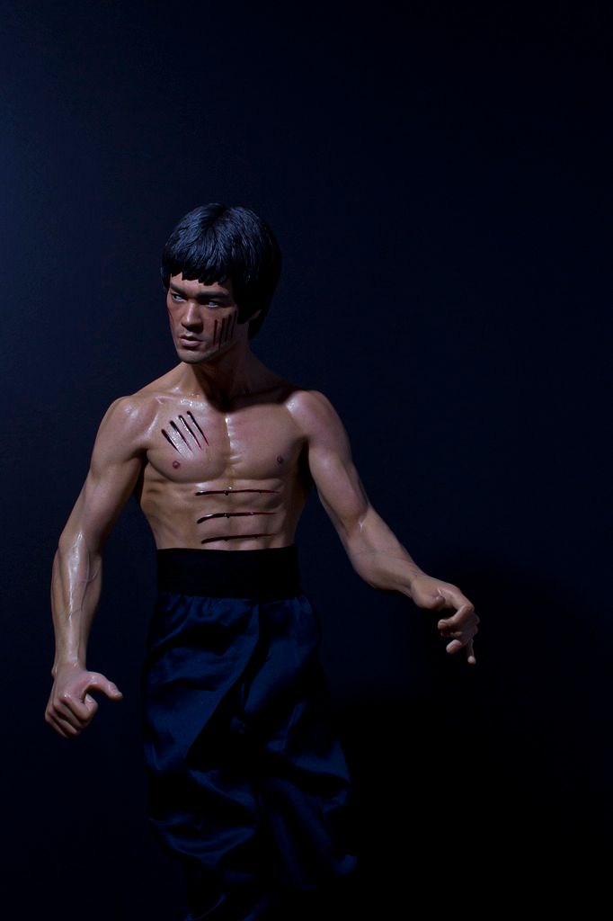
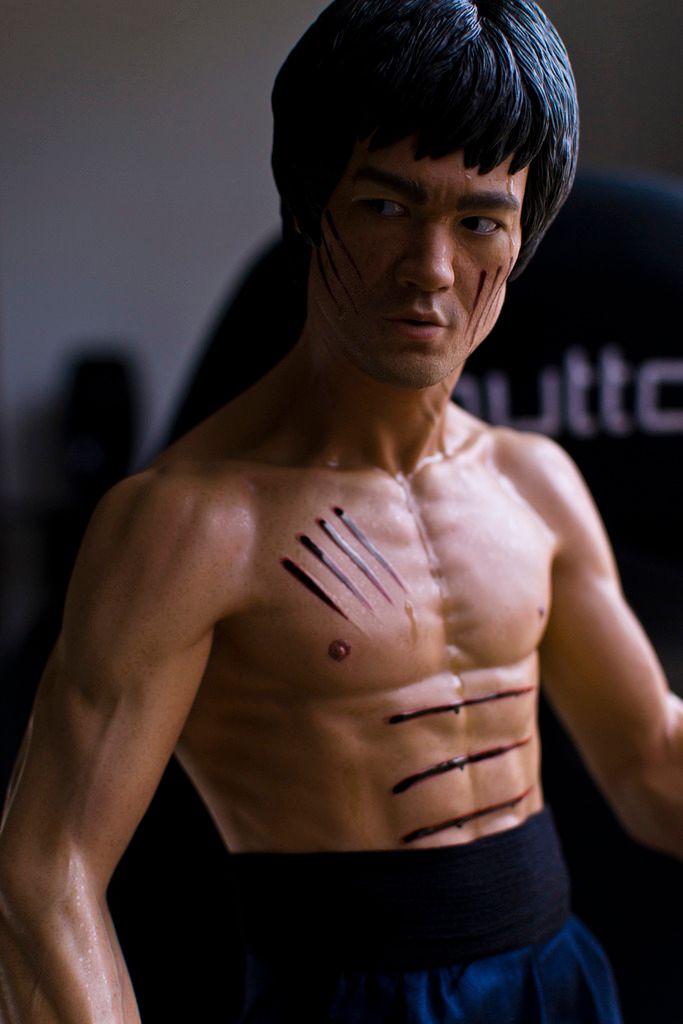
I have some good news for those of you who were unhappy with the colour of the body. I got home from work tonight and while there was still some light outside, I took the statue out into some natural light to get an idea of what the statue looks like in natural light and it is actually a really nice darkish, reddish tan colour, similar to Tyderium's photoshopped pic.
It actually looks really nice and the various tones/shading are more visible but still subtle, but I think it's perfect as anymore would look too artificial IMO. The excessive shading is usually best suited to figures that have unnatural flesh tones, such as comic statues, or Pop Culture Shock's Street Fighter statues are a good example, whereas this piece has a more realistic and natural looking base flesh colour. Some very slight shading would probably be alright, but nothing major.
Honestly though, I think as is, just fix up the sweat and cuts and it's pretty close to spot on IMO.
The reason why my original pics had a slightly yellowish pale tone to the skin is due to the fact that the statue was in a room lit with halogen lights which have a yellow tinge to them. I then used some small LED lights which are cool white in colour shining over the statue to correct the colour and add shadows, and give it a more natural appearance, but white LED's also have a tendency to make statues appear slightly pale, although I think it makes them look more realistic.
I'd say the large discrepancy in the colour between natural light and the light in room may also have to do with the translucent material of the statue, but I'm not sure. Either way I think it's pretty amazing how different in can look depending on how it's lit.
Anyway, I took a quick pic with the statue by the window to try and give you a better idea of the colour. It was a little hard to get a good shot as I was in a tight space and there wasn't a lot of light due to being overcast and getting dark by that time, but I'll try get some better pics on the weekend. For now, enjoy:


")