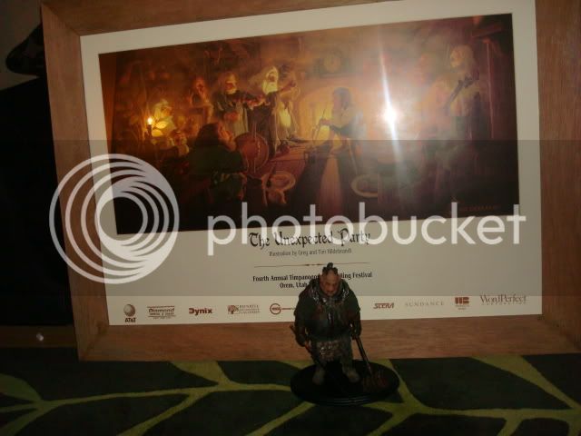
A LONG awaited party!

Collector Freaks Forum

Help Support Collector Freaks Forum:

This site may earn a commission from merchant affiliate links, including eBay, Amazon, and others.

DaveMac

Super Freak
Joined
Jan 13, 2009
Messages
1,480
Reaction score
4
Location
West Yorkshire, U.K
I've had this print for a while and finally got round to getting it framed in a way to do the fine art of the Hildebrandt bros proud.
I knew the look I wanted, but not how to achieve it, until a colleague at work told me he is starting his own framing business as a hobby. We talked about the look I wanted ; earthy, a bit aged/worn, solid looking and complementary to the tones of the artwork.

He came up with old solid oak floor boards which he stripped the top layer off to expose the beauty underneath. With a few ingrained stains, a few nail holes and minor cracks left in it looks a lot better than the photo's do justice and smells wonderful!!

I am happy to recommend him having seen a fair few of the pieces he has done and he is very reasonable and willing to try whatever frame design you may have in mind :lecture

hobbitpic011.jpg


hobbitpic010.jpg


hobbitpic005.jpg


hobbitpic004.jpg


hobbitpic002.jpg
 
Sorry to say not overly impressed. Looks like cheap oak to me and not even very good selection of pieces. The bottom left looks DIRTY. If thats what you're going for ok.
 
Looks cool. As long as you're happy with it DM thats all that matters.

Sorry to say not overly impressed. Looks like cheap oak to me and not even very good selection of pieces. The bottom left looks DIRTY. If thats what you're going for ok.

Jeez :slap:
 
Sorry to say not overly impressed. Looks like cheap oak to me and not even very good selection of pieces. The bottom left looks DIRTY. If thats what you're going for ok.

:rotfl

Yep, that's the look as outlined in the description, and I suppose that's a fair comment (as outlined in your avatar heading) :wink1:


New and 'veneered' is also an option :lecture
 
I like it. Having a vision and seeing it through is what art is all about. :lecture
 
That's a beautiful print and I think the frame looks quite nice with it. That's a great idea using old floor boards - I personally prefer darker woods myself - but as NAZGUL-KING said, it does look Shire-ish...like something you would see hanging in Bag End. :)
 
Sorry to say not overly impressed. Looks like cheap oak to me and not even very good selection of pieces. The bottom left looks DIRTY. If thats what you're going for ok.


LOL...God Damn! Someone poor this man a clean bowl of Cheerios!:)

I see the look you were going for, DaveMac. It looks good. And I do get a bit of a "Shire" feeling from it. I think the one thing I might have done differently would have been to "rough up" the wood a little because I always thought of the beams in Hobbits' houses as haveing been rough cut.
 
I love the Hildebrandt Brothers artwork. Grew up with their coffee table books and calendars. That particular scene is one of my faves. Love it! :clap

I also agree with RoboDad... A bit darker stain would compliment the colors a bit more.
 
Thanks all!

I did consider going darker but still unsure as the actual colouring looks better in person. Another idea is to put some kind of elvish script around the frame and then wax it which will bring out the grain and darken it a bit. Not sure what I would have written though as 'One ring ...etc, etc' seems a bit heavy and out of place for this scene. Maybe something in Dwarfish?

Any suggestions (other than burn it :lol ) most welcome
 
I've always liked this Bilbo quote:

It's a dangerous business, going out your door. You step onto the road, and if you don't keep your feet, there's no telling where you might be swept off to.

And it fits well with The Unexpected Party. Though how you would write it in Elvish or Dwarfish, I have no idea. :lol

Perfect quote Jen, and I think you can find some online Elvish Translators. You can probably even download a font for MS Word too and then trace/etch onto the frame.

I think the frame loks very nice, and has a perfectly Hobbity feel!
 
How about this:

The Road Goes Ever On (Sindarin)


Mîn reniar ui,
Or 'ornd a nu 'aladh,
Na grŷd ias ú-hilant arui Anor,
Na chelith in ú-hir arui i-aear;
or loss rennen na rîw,
A trî i lyth ’elir en Nórui,
or 'lae ah or 'ond,
A nuin erydh mi Ithil.
Mîn reniar ui,
Dî faun a di êl,
tail in ú-reniar hi
Ethol na mâr haer.
Hind in egennir naur a vegil
Ah angos mi thaim e-gond
Cennir berth gailen
A gelaid ah emyn istianner and.​
 
I happen to like the floorboard approach, and I think this turned out nice, folksy and charming. Which seems to be the intent, so I say job well done.
 
Looks cool to me. :D

Sorry to say not overly impressed. Looks like cheap oak to me and not even very good selection of pieces. The bottom left looks DIRTY. If thats what you're going for ok.

:slap

Tact noun \'takt\ a keen sense of what to do or say in order to maintain good relations with others or avoid offense.
 
Mmmmmm, some good suggestions there people. I will have a weigh up and see what might look good. Thanks again for the kind comments. :peace
 
I've always liked this Bilbo quote:

It's a dangerous business, going out your door. You step onto the road, and if you don't keep your feet, there's no telling where you might be swept off to.

And it fits well with The Unexpected Party. Though how you would write it in Elvish or Dwarfish, I have no idea. :lol

Perfect quote for the piece and it probably would work well going around the frame. I think RoboDad's suggestion is really good too but to mean it seems to long of a quote to fit on the frame.

The frame looks nice. I agree with the shire-ish comments and also the comments about making it maybe a shade darker but that's just my own personal preference.
 
I really like this, the frame fits the artwork inside perfectly.
It could have been a tint darker, but I think you can determine that best when you see it in hand in the correct lighting. And it's a matter of personal taste.
 
Back
Top