jkno
Stormtrooper
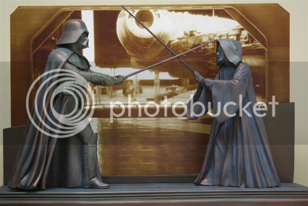
Even though i don't own this diorama (yet) i saw it at a friend's house and had the chance to inspect it in detail. I think there are 2 huge problems which takes away some of the dynamic elements.
the first one might sound very irrelevant to many of you, but if you practise any martial art, you would know that when you are holding any sword (and in the case of OT lightsaber duels, Lucas formed the basis on a samurai sword fighting tecnique known as iaido) your hands should always be on your 'center' that is to say, if you imagine the invisible line that goes vertically from the tip of your head to your feet, it is centered between your eyes and the middle of your nose, that is always where you keep your hands and your sword.. in a stance, you do not leave your center open.. Obi Wan has both hands and lightsaber out of that center, which makes it look very awkward, or in other words, an untrained fighter..
the second one is, Obi Wan's lightsaber is done so badly.. i really do not understand why.. i am not just talking about the colors, but the emitter is so thick and fat, it looks like a toy.. if this is about the metal rod that is supposed to go in there, couldn't they think of a better solution than playing with the non uniform scale of the lightsaber?
overall, i LOVE this piece and will try to get one.. but these 2 problems are just my humble thoughts...
Interesting point of view
 And: Welcome to SSF


