DarkDaysinVegas
Super Freak
Kurt.
I downloaded that Gimp program, but I don't have a clue how to use it.
I downloaded that Gimp program, but I don't have a clue how to use it.


Kurt.
I downloaded that Gimp program, but I don't have a clue how to use it.
Specifically, what keyboard commands were giving you trouble?
I've never used the app, but from what cursory knowledge I do have of Elements, I think you would encounter some stumbling blocks if you attempt to follow the tutorial step-by-step.WOW!! This is a great tutorial!!! i just found this thread so have not had time to go through it. But I have Photoshop Elements 5.0. Will this tutorial work for it???
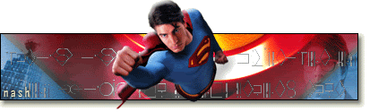
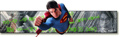
I figured that was what it had to be, but the upper curvature of the "S" and that white hot spot was throwing me off.Thanks frankenfan! the background is the bottom piece of superman's S symbol. I really didnt know what to use so I just took a crop of that. Im not very good at improvising as I don't really know how to use effects all that well. Im better at following instructions hehe.
PS: going back to the animated lights thing... would you be able to give me some advice on how to make the kryptonian text in my sig pulsate? I'd like to keep superman, and possibly the clark and daily planet pics, but maybe find something new for the background too. but i think it would be cool to have the text glow
Lonnie already supplied you with the direct link, and if you look at the directory on the upper right corner of the GIMP home page, you'll also find links to the feature set, user group, etc.Kurt.
I downloaded that Gimp program, but I don't have a clue how to use it.
Thanks again, Nash! I'll make a note of that, and add it to the tut!Taking another try at a sig. I found that in Step 10 where it says to press Command J for a New Layer above Data 2, in PC you press Shift CTRL N for a new layer.
The neutral background makes Supe's "pop" more now, but I think the warm color of the Planet Building seems out of place, especially with the image of Clark balancing it on he right.Second try. figured out some things i did incorrectly the first time, mainly how to use the gradient tool. Also used a crop of the fortress for the background instead.
Excellent question!Quick question... Is there any way to make one tool a default over another when they both use the same shortcut?
Thanks, Kit!Pretty cool. I wish I had photoshop software on my computer, but seems like the cheapest one I have seen for sale is $100.

Thanks Kurt, that helps a lot! A sig and avatar soon...
 Can't wait!
Brutal? Never! Helpful? I hope so!OK, here is something I was playing around with, but it is not going to be my sig... I'm still trying to find some images and come up with some ideas for the real thing! In the meantime, what do you think about this, and please, don't be afraid to be brutally honest!!! I can take it!
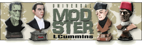
 . You may want to think about lightening the shadow of the emboss on the Monster and Drac, as it appears a bit severe, at least to me. In addition, I would lose the drop shadow on the banner, and add the effect to the busts. I would also increase the height of the banner, to have a bit more of the busts against the background. (BTW, the current width of your banner is in violation of Darklord Dave's size restriction! Bad Mod!)

For the background, I'd choose something neutral, to make the busts pop. Here, I chose a taupe color and added an abstract shape with the brush tool. I also added your name to the background, rather than having it "float."I need something else for the background, I already know that much...
Brutal? Never! Helpful? I hope so!
I like the busts, and I think you did a good job sizing them relative to each other, given the difference in the height and width of the pedestal bases, and Drac's overall ginormity
If you want to use text as a background element over which other elements are placed, select a bold sans-serif font (top), with tight kerning (space between letters), rather than an open, serif face (bottom):...
For the background, I'd choose something neutral, to make the busts pop. Here, I chose a taupe color and added an abstract shape with the brush tool. I also added your name to the background, rather than having it "float."...
Enter your email address to join: