I loved his art style in the original Dark Knight Returns. And will say the B+W look works for Sin City. But for everything else, his art looks lazy now.
You are using an out of date browser. It may not display this or other websites correctly.
You should upgrade or use an alternative browser.
You should upgrade or use an alternative browser.
Frank Miller appreciation thread
- Thread starter Otomofan
- Start date


Help Support Collector Freaks Forum:
This site may earn a commission from merchant affiliate
links, including eBay, Amazon, and others.
Otomofan
Super Freak
- Joined
- Nov 8, 2009
- Messages
- 4,986
- Reaction score
- 3,560
Yeah you can literally watch it progress with each chapter of Sin City. The first few chapters are intricately detailed, almost as much so as Elektra Lives Again, but as the story progresses, backgrounds are seen less and less, and more of the art just becomes moody black and white shadowplay. Which I don't mind, but it's just a shame to see it come at the expense of the detail he used to be renowned for.
As the Sin City series progresses, each project becomes more and more cartoony and exaggerated, with the big feet and hands becoming the norm.
"Hell and Back" shares very little stylistically with "Hard Goodbye" other than both are in Black and White.
By the time he got to Dark Knight Strikes Again, he was just plain phoning it in. It's simply a collection of wacky cartoon sketches with no backgrounds.
Believe it or not, as reviled as the book was, i think Holy Terror was the last time he put any effort into drawing, and even then it was just a pale imitation of his glory days.
Without knowing the man I can't say for sure, but I think it's just laziness. He proved himself decades ago so there's no reason to now. But I also think age and health is a factor. He might not be able to physically sit still and put the hours it requires to draw the way he did.
Even so....I'm still glad to get lazy Frank Miller instead of the traced, shiny, computer colored crap that Marvel and DC churn out these days. Even Frank's lazy stuff has character.
Otomofan
Super Freak
- Joined
- Nov 8, 2009
- Messages
- 4,986
- Reaction score
- 3,560
So the Robin 80th Anniversary special included a new pin up of Carrie Kelley, other than just the cover.
As usual, Alex Sinclair has taken a (pretty lousy actually) FM picture and made it even worse with his overdone shiny computer colors. He's added all kinds of lines and textures that were clearly not in the original art.
 001-093.jpg")
It's not a great drawing. I tried messing around with effects to see if it looked better with just the linework, but I couldn't really get rid of Sinclair's shiny crap. It's really not very good any way you look at it.
 001-093.jpg")


Otomofan
Super Freak
- Joined
- Nov 8, 2009
- Messages
- 4,986
- Reaction score
- 3,560
Pulled this page from the execrable Golden Child.....hoping the behind the scenes commentary might give some indication as to just how exactly the Joker survived having his neck snapped and then his corpse burned to a charred skeleton.
And there it was...and it's the most profoundly stupid thing I've ever read in relation to any of Frank Miller's works...and this is the guy that wrote the universally-loathed Holy Terror. Which was still better than Superman Year One by the way. This dreck was literally unreadable. I couldn't finish it.

And there it was...and it's the most profoundly stupid thing I've ever read in relation to any of Frank Miller's works...and this is the guy that wrote the universally-loathed Holy Terror. Which was still better than Superman Year One by the way. This dreck was literally unreadable. I couldn't finish it.

Otomofan
Super Freak
- Joined
- Nov 8, 2009
- Messages
- 4,986
- Reaction score
- 3,560
Yuck. That last post made me so mad I need a palette cleanser.
Recently it seems like Frank has upped his game on the cover sketches, which is nice cause he charges people $1250 per sketch. In the past I've seen some awful doodles that I would have been horrified to see if I'd spent more than a Trump Bucks check on, but this latest batch looks like he's putting more effort into them, which is nice.
None of them are really fit to be used as actual covers, but they're pretty good. I'd be thrilled to own any of these. (Still have my Trump bucks but I'm sure these are all in collectors' hands already...)


ebor
Super Freak
Wait WHAT!?! Miller charges $1250 for those sketches...pass...what a shill...
Otomofan
Super Freak
- Joined
- Nov 8, 2009
- Messages
- 4,986
- Reaction score
- 3,560
Yeah. I have no idea what he could possibly need that kind of money for. He's supposedly worth $45 MILLION already. Doesn't have any kids, as far as I know. So what's with charging so much? Just cause he can, maybe? Like an ego thing....he's one of the last living legends in comics so he doesn't wanna settle for less than top dollar? He charges $100 per autograph, too.
He posted this on instagram today.

He posted this on instagram today.

SwedishHeat
Super Freak
- Joined
- Sep 13, 2006
- Messages
- 8,117
- Reaction score
- 882
All I can really say is that Janson and Varley should receive much more credit for the efforts working with Miller.
Otomofan
Super Freak
- Joined
- Nov 8, 2009
- Messages
- 4,986
- Reaction score
- 3,560
Well, I don't think that's totally fair, cause Miller put a hell of a lot more effort into his projects in the 80s.
Janson's inks were very good, but a lot of his own style can "superimpose" over what he's inking. My favorite images from DK are the few that Frank inked himself.
Varley absolutely colored Frank's stuff like nobody else. Their work on Elektra Lives Again, the Lone Wolf covers, and the Wolverine TPB cover are absolutely among my favorite comic book art of all time.
The sad thing about Frank Miller's bibliography is that it really is very small. You have his run on Daredevil, Ronin, Dark Knight, Year One and Born Again, Elektra Lives Again, Sin City, 300....and that's really the last truly great thing he did, and definitely the last great collaboration with Varley.
Dark Knight Strikes Again is when they both just seemingly threw in the towel and decided to turn out trash for money. Varley's digital "coloring" is absolutely worse than Miller's lazy drawing in the book.
Frank has only completed two projects since then....Holy Terror and Xerxes, the reaction to both running the gamut from "awful" to "unreadable."
It is impressive that one man was able to make such a huge difference and be so influential in the industry with such a tiny body of work.
ebor
Super Freak
Well, I don't think that's totally fair, cause Miller put a hell of a lot more effort into his projects in the 80s.
Janson's inks were very good, but a lot of his own style can "superimpose" over what he's inking. My favorite images from DK are the few that Frank inked himself.
Varley absolutely colored Frank's stuff like nobody else. Their work on Elektra Lives Again, the Lone Wolf covers, and the Wolverine TPB cover are absolutely among my favorite comic book art of all time.
The sad thing about Frank Miller's bibliography is that it really is very small. You have his run on Daredevil, Ronin, Dark Knight, Year One and Born Again, Elektra Lives Again, Sin City, 300....and that's really the last truly great thing he did, and definitely the last great collaboration with Varley.
Dark Knight Strikes Again is when they both just seemingly threw in the towel and decided to turn out trash for money. Varley's digital "coloring" is absolutely worse than Miller's lazy drawing in the book.
Frank has only completed two projects since then....Holy Terror and Xerxes, the reaction to both running the gamut from "awful" to "unreadable."
It is impressive that one man was able to make such a huge difference and be so influential in the industry with such a tiny body of work.
very similar to Barry Windsor Smith...
my favorite Comic Artist of all time...and very few projects statistically speaking.
Otomofan
Super Freak
- Joined
- Nov 8, 2009
- Messages
- 4,986
- Reaction score
- 3,560
It's funny how the "super-stars" of that generation differed. There were guys like John Byrne with just an amazing output; drawing a monthly book pretty much his entire career, and then a guy like Art Adams whose work was so intricate that even in his prime he rarely did interiors.
Or a guy like Mike Mignola that kind of slogged it out taking anything he could get in his first years, until he refined his style and pretty much exclusively did Hellboy.
And what happened to Sam Keith? He did a lot of stuff at Marvel in the early 90s, and then seemingly disappeared after The Maxx.
Brian Bolland hasn't done interiors in decades, but he was always super slow and he became THE go-to guy at DC for covers. Come to think of it, what about Alex Ross....has he done ANY interiors other than Marvels and Kingdom Come other than the occasional two-page spread? I don't mind really...I think he's a one-trick pony and I got bored with style pretty quickly. He's still doing covers though.
All of these guys have pretty much disappeared from doing regular work, simply cause they're so rich they don't have to? They make more money doing covers and sketches than interiors, so why bother putting in the work?
That definitely seems to be the case with Frank.
It's too bad. Movie directors keep going into their 80s sometimes if they still have stories to tell. I guess doing interior art for full comic book stories is too labor-intensive for these guys, and they simply don't have anything left they want to say.
I'm mostly disappointed that Frank has seemingly abandoned Sin City. There hasn't been a new project in about 20 years. Yeah, there was that lousy movie sequel. It was awful but I'd still appreciate having it in comics form. He always said there was so much more he wanted to do with Sin City but he apparently ran out of steam. Well, I guess when you have $50 million and can make another $1250 for five minutes (or less) doodling, there's no incentive to make any more real comics.
Otomofan
Super Freak
- Joined
- Nov 8, 2009
- Messages
- 4,986
- Reaction score
- 3,560
It's finally here!! I ordered it months ago and there were delays but tonight it finally landed on my doorstep.
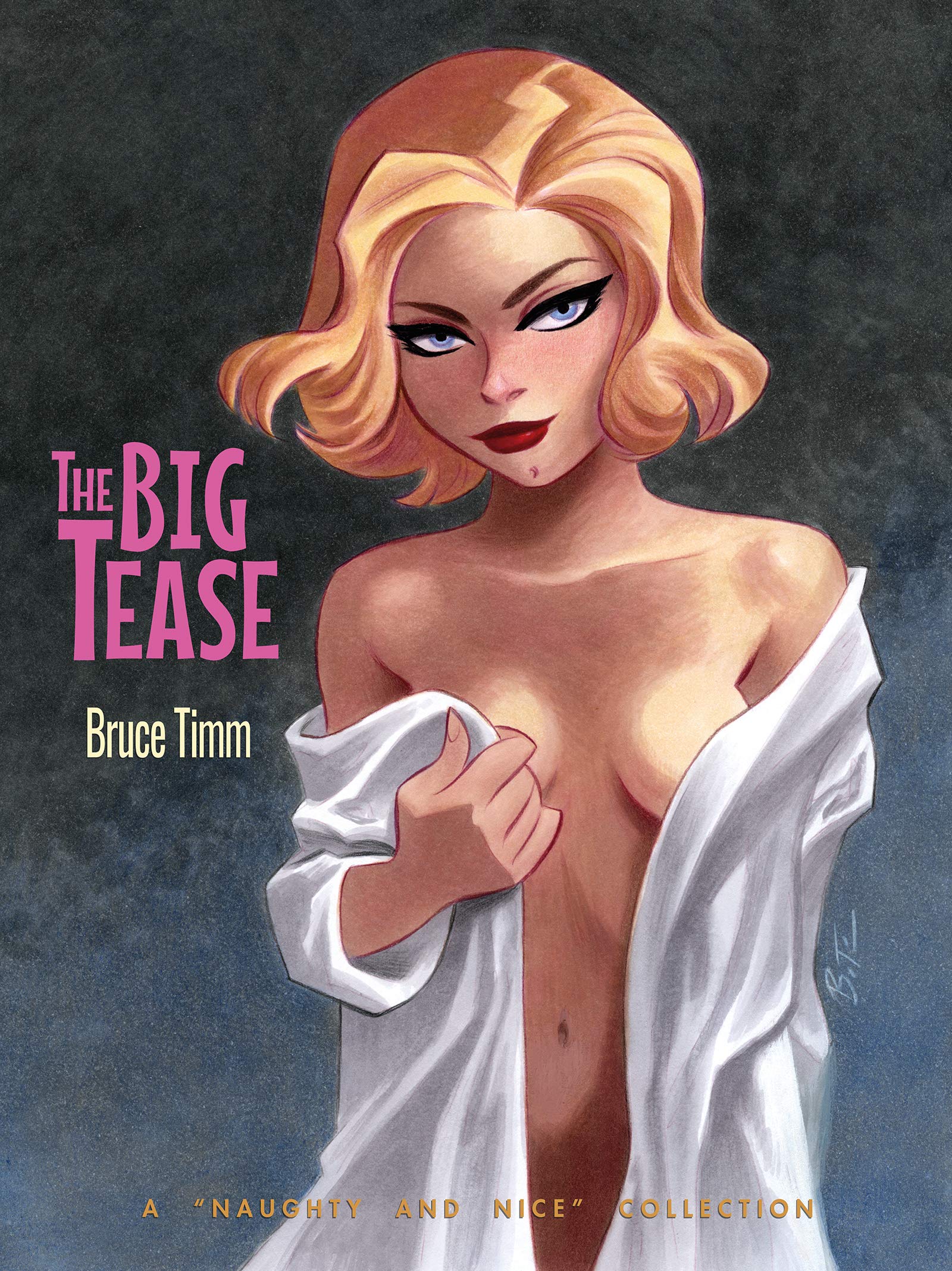
"The Big Tease" by Bruce Timm. 200 pages of drawings of nude women by the creator of Batman: The Animated Series. Maybe it's not for everyone. Maybe it's not for MOST people really. But speaking for myself, I love it. The man is a master.
So why the Frank Miller thread?
Well, way back BT did a Sin City pinup in one of the books featuring Marv and Goldie/Wendy and Nancy on stage.

Well, in his new sketchbook Bruce gave the old stark black and white Sin City style a try. Cool, huh?

Otomofan
Super Freak
- Joined
- Nov 8, 2009
- Messages
- 4,986
- Reaction score
- 3,560
Found some early old scans from "Comics Interview" magazine in the 80s. He was promoting Ronin and Dark Knight obviously, and later poking fun at DC when he went through his "censorship obsession" years. Finally there's a sketch of RoboCop we've probably all seen, but it claims at the time he was writing RoboCop 2 this was the only drawing he did. He eventually went on to do those variant covers for a Robo series, but that was decades later.


Otomofan
Super Freak
- Joined
- Nov 8, 2009
- Messages
- 4,986
- Reaction score
- 3,560
In honor of Frank's birthday today.....
Here's a NEW piece fully inked by Klaus Janson.
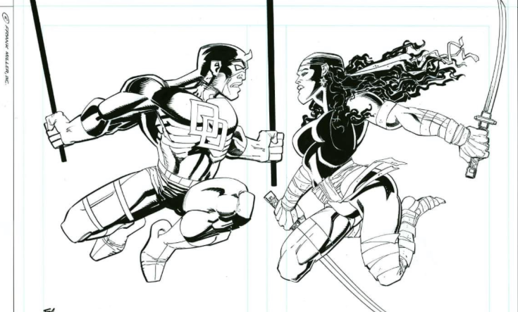
You can see Klaus REALLY cleaned it up, but it still has those bizarre and awkward poses Frank has been using the last few years. Still, it's nice to see the two of them do DD and Elektra again.
Here's a NEW piece fully inked by Klaus Janson.
You can see Klaus REALLY cleaned it up, but it still has those bizarre and awkward poses Frank has been using the last few years. Still, it's nice to see the two of them do DD and Elektra again.
Otomofan
Super Freak
- Joined
- Nov 8, 2009
- Messages
- 4,986
- Reaction score
- 3,560
I have a friend that's as nuts about Miller's work as I am.
Difference is, he has the disposable income to REALLY indulge.
Last year he paid for an original head sketch and chose Marv. Frank did a really great job on it, actually.
Well....my buddy must have more money than sense cause he went all in and went ahead and ordered a FULL size, original commission. We're talking like 10 grand here.
We were both nervous cause we didn't know if it was gonna turn out sloppy or be more like Frank's former greatness. Once again, he chose to get Marv, which i think was a good choice cause clearly Frank cares about his own character and likes to draw him.
Well, I saw a pic of the commission today and it's freaking outstanding. Frank actually seemed to take his time with it. It's definitely better than most of the stuff he's actually published in the last five years.
When I get permission from my friend, I'll post pics here.
Similar threads
- Replies
- 0
- Views
- 666
- Replies
- 6
- Views
- 1K
- Replies
- 22
- Views
- 2K
- Replies
- 15
- Views
- 4K