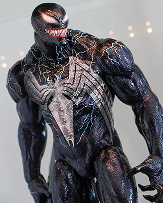
Me too. I was so relieved when I first saw the 2018 movie design, which (outside of the white spider for obvious reasons) otherwise nailed the design with the classic grin and overall proportions. So many artists like to draw Venom with warped misshapen proportions and 6 foot tongues that perpetually hang out of his mouth covered in green goo, I was quite happy to see something grounded closer to his original design. Of course the tongue still comes into play frequently where appropriate, which is how it should be. Outside of that spider emblem, it'd be hard for me to ask for more from the design.


") [Just out of curiosity, are you planning on getting Carnage to go with Venom?]
[Just out of curiosity, are you planning on getting Carnage to go with Venom?]